portfolio
DESCRIPTION
A collection of work by Chamray MacDonaldTRANSCRIPT

interior design
chamray macdonald
portfolio


cchamray

2

DESIGN
TECHNICAL
BRAND
BUILD
the local
trail mix
revit architecture
Product Catalogue collection
light and form
CONTENTS4
14
22
32
40
3

THE
PUB PAPER BAG
design
4

!"#$%&'(
the OVERVIEW:The Mixed Use project focuses on the design of a restaurant and bar where both hostel guests (from the above floors) as well as local Winnipegers can gather to enjoy beverages and snacks in an inviting environment.
HOSPITALITY: restaurant
MIXED USE
the PROGRAMME: Seating and tables for 100 -125 Service counter with cash register and other point of sale equipmentFood preparation area with equipment necessary for preparation of menu items Food storage Dishware storage Coffee/latte/espresso equipment Brewery equipment Staff room & secure storage for 2-3 employees Public washrooms Maintenance room (brooms, mops, pails, etc.)General supplies storage area (napkins, condiments, etc.)
the SITE:The Scott Fruit Company Warehouse located at 319 Elgin Avenue, Winnipeg Manitoba.
!"#$%&$'()
GOALS
To provide a sociopetal space that facilitates multiple forms of socialization. A variety of seating options combined with multiple levels of intimacy will accommodate all patrons.
To bring the back of house production process to the patron. This will create visual interest and a unique experience.
Circulation forms combined with cross axis circulation will work to provide an exciting restaurant experience.
LOCALthe
5

LOCALthe
BASEMENT FLOOR PLAN
1’ 2’ 5’ 10’
1
4 4A
6

1’ 2’ 5’ 10’
44B
FIRST FLOOR PLAN2
4 4A
7

1’ 2’ 5’ 10’
44B
3
4 4A
SECOND FLOOR PLAN
8

PRO
DU
CED
BY
AN
AU
TOD
ESK
ED
UC
ATI
ON
AL
PRO
DU
CT
PRODUCED BY AN AUTODESK EDUCATIONAL PRODUCT
PRO
DU
CED
BY A
N A
UTO
DESK
EDU
CA
TION
AL PR
OD
UC
T
PRODUCED BY AN AUTODESK EDUCATIONAL PRODUCT
MAIN LEVEL0' - 0"
-9' - 6"
2nd LEVEL16' - 0"
3rd LEVEL28' - 0"
ROOF
Grade-3' - 0 1/4"
TRAIL
MIX
PRO
DU
CED
BY
AN
AU
TOD
ESK
ED
UC
ATI
ON
AL
PRO
DU
CT
PRODUCED BY AN AUTODESK EDUCATIONAL PRODUCT
PRO
DU
CED
BY A
N A
UTO
DESK
EDU
CA
TION
AL PR
OD
UC
T
PRODUCED BY AN AUTODESK EDUCATIONAL PRODUCT
1’ 2’ 5’ 10’
NORTHEAST SECTION4A
NORTHWEST SECTION4B
9

8
REFLECTED CEILING PLAN MAIN FLOORSCALE: 1/8” = 1’0”
THE GASTROPUBCRAVE
1’ 2’ 5’ 10’
LOCALthe
5 FIRST FLOOR REFLECTED CEILING PLAN
10

FOOD BAR & FORNO
renderings
11

LOUNGE & BAR
FORNO & BAR DINING ROOM

LOCALthematerials and colors
13
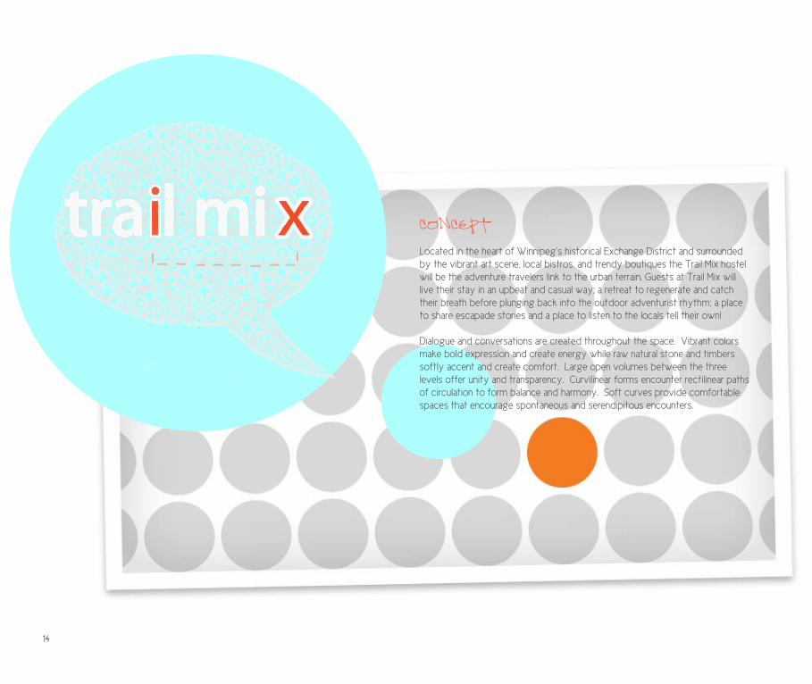
CONCEPT
Located in the heart of Winnipeg’s historical Exchange District and surrounded by the vibrant art scene, local bistros, and trendy boutiques the Trail Mix hostel will be the adventure travelers link to the urban terrain. Guests at Trail Mix will live their stay in an upbeat and casual way; a retreat to regenerate and catch their breath before plunging back into the outdoor adventurist rhythm; a place to share escapade stories and a place to listen to the locals tell their own!
Dialogue and conversations are created throughout the space. Vibrant colors make bold expression and create energy while raw natural stone and timbers softly accent and create comfort. Large open volumes between the three levels offer unity and transparency. Curvilinear forms encounter rectilinear paths of circulation to form balance and harmony. Soft curves provide comfortable spaces that encourage spontaneous and serendipitous encounters.
14

the OVERVIEW:Design a hostel for adventure travellers who will come to Winnipeg for a variety of reasons including adventure cycling, geocaching and other outdoor activities.
HOSPITALITY: hostel
MIXED USE
the PROGRAMME: Check-in/information desk (seating for employees and guests, point of sale equipment, paper supplies, maps, bus passes, etc.)Secure office with photocopier, printer, scanner, computer, shredder, paper storage, file storage, safe, task chair, guest chair, desk, etc.Secure staff area for at least two staff membersSecure accommodations for up to 50 guestsGeneral washrooms in public areasStaff washroomLounges with seating for up to 30 peopleKitchenLaundry Storage room with clean linen and other supplies
the SITE:The Scott Fruit Company Warehouse located at 319 Elgin Avenue, Winnipeg Manitoba.
15

FIRST FLOOR PLAN1
33A
16

SECOND FLOOR PLAN2
33A
17

NORTHWEST SECTION3
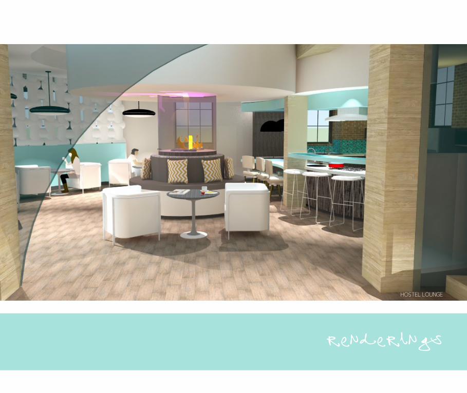
HOSTEL LOUNGE
renderings

HOSTEL KITCHEN
HOSTEL LOUNGE20

READING AREA
ENTERTAINMENT AREA21

REVIT architecture
22

23

24

25

26

27

28

renderings
29

30

day light measures31

PRODUCTCATALOGUECOLLECTION

the BRIEF:The goal of the exhibition display, satellite form and branding of the PCC is to create renewed interest and excitement within the space. As the networking and communications team, our emphasis is based on creating connections between all aspects of the design. Implementing a logo and overall branding will reinforce the existing identity of the PCC. The logo will be a critical starting point for creating the relationships between the elements of the overall design. The entrance to the PCC will be restructured to incorporate signage as well as a digital component to showcase materials and their applications. Incorporating signage on the exterior of the PCC is crucial in bringing attention to the space. Further visual cues will be included in conjunction with the main form to enable users to navigate the space with ease.
NETWORKING:
BRANDING
the CONCEPT: A seed encapsulates all the necessary constituents for growth and development. When planted in the proper environment a seed begins to germinate and take root, ultimately yielding a product that will be pollinated and transplanted to new places. The logo is a seed, embodying the essence of the Product Catalogue Collection that continually renews a branded identity. This visual reinforcement creates way finding and an overall theme that will help students, faculty members, and visitors to access the space and use it in an efficient manner.
PRODUCTCATALOGUECOLLECTION
33

PRODUCTCATALOGUECOLLECTION
PRODUCTCATALOGUECOLLECTION
logo development:
By creating a logo and identity for the PCC we are able to classify a specific service that is distinct from other services offered at the University of Manitoba. A logo is used to embody and identify a direct and immediate translation to simplify the essence of the Product Catalogue Library. Mandatory guidelines were followed in the creation of the logo; color scheme, font and layout had to be approved by the university.
LOGO DEVELOPMENT
FINAL LOGO
34

way finding, signage & process
The PCC location is set back from the main hall and is easily missed. The highlighted print in the above image was the only exterior signage to identify and direct students to the PCC. We proposed a large eye catching sign with directional cues to activate the space. The proposal was modified due to time and budget. The approved main signage is constructed of a wooden frame with canvas in between. The placement of the canvas allows for a strong visual cue to the existence of the PCC. The canvas provides a backdrop for steel lettering consisting of the words “Product Catalogue Collection” , “Faculty of Architecture”, as well as the logo. The canvas print offers circular directional cues to bring attention to the main entrance of the PCC.
PROPOSED SIGN COMPLETED SIGN
SIGN DETAILS

The PCC is indexed following the MasterFormat. MasterFormat is a list of numbers and titles, classified in divisions by work results or construction practices. It is widely utilized by the construction industry as a standard. In this context, it organizes project manuals, detailed cost information, and drawing notations to specifications.
Physical material samples are provided where applicable. These provide an opportunity to experience of the materials first hand. Each division can be found in a section of the collection, as seen on the map.
How to use the PCC :
1. If you know what you are looking for, the map indicates the division numbers that carry documentation and physical material samples
2. If you are unsure where to find the material you are looking for, please refer to the MasterFormat guide book, at the front desk
3. Additionally, the PCC Blog : http://umpcc.wordpress.com, can give you access to the Product Database, where up to date information on various divisions can be found
4. Samples can be ordered (ordering sheets at front desk) according to the company name, product type, pattern code, color name and color code. Please fill out as much information as possible to make the ordering process quick and easy
5. If you are looking for physical samples to use right away, the cage (also located on the map) provides a number of products for immediate use
If you have any questions or would like an orientation, please don’t hesitate to ask.
We are here to help you!
Welcome to the
PRODUCTCATALOGUECOLLECTION
A map with guide cards have been created and located at the entrance to ensure the PCC is easily navigated. The map indicates the placement of products within the space and their master format categorization. Guide cards instruct the user in a step-by-step format on how to use the master format and how to order products. Large white steel labels have been designed and installed to clearly identify categories within the collection.
36

map at entrance map detail

wayfinding
MASTER FORMAT SIGNAGE
MATERIALS ROOM SIGNAGE
38

!"#$%&'%&()*+%(&"(,*-*./01,++
234*5678*97:86:4*79*;<=;>94?<@@A*;@6B4C*><D97C4*>?*D34*.11*B>89D=<BD4C*>?*6*E>>C48*?=654*E7D3*B68F69*78*G4DE448H*234*
;@6B4548D*>?*D34*B68F69*6@@>E9*?>=*6*9D=>8:*F79<6@*B<4*D>*D34*4I79D48B4*>?*D34*.11H*234*B68F69*;=>F7C49*6*G6BJC=>;*?>=*9D44@*
97:86:4*B>8979D78:*>?*D34*E>=C9*K.=>C<BD*16D6@>:<4*1>@@4BD7>8L*68C*K$6B<@DA*>?*"=B37D4B3<=4L*69*E4@@*69*D34*@>:>H*234*B68F69*
;=78D*79*C7=4BD7>86@*?>B<978:*6DD48D7>8*>8*D34*48D=68B4*D>*D34*.11H**"*56;*E7D3*:<7C4*B6=C9*36F4*G448*B=46D4C*D>*489<=4*D34*.11*
79*4697@A*86F7:6D4CH*234*56;*78*D34*?=>8D*48D=68B4*78C7B6D49*D34*;@6B4548D*>?*;=>C<BD9*E7D378*D34*9;6B4*68C*D347=*569D4=*?>=56D*
B6D4:>=7M6D7>8H*(<7C4*B6=C9*789D=<BD*D34*<94=*78*6*9D4;NGAN9D4;*?>=56D*>8*3>E*D>*<94*D34*569D4=*?>=56D*68C*>=C4=*;=>C<BD9H**
O6=:4*E37D4*9D44@*@6G4@9*36F4*G448*C497:84C*68C*789D6@@4C*D>*B@46=@A*7C48D7?A*B6D4:>=749*E7D378*D34*B>@@4BD7>8H**234*5678*97:86:4*79*
;<=;>94?<@@A*;@6B4C*><D97C4*>?*D34*.11*B>89D=<BD4C*>?*6*E>>C48*?=654*E7D3*B68F69*78*G4DE448H*234*B68F69
1P22%&(*'%"(/"Q*+%(&"(,
+1"O,R*STULVSWNXL
!!
"#$%&'(&')*+*,&)'#)-
./00&')*(&#)1#2*,&)'#)-,.#3-4*567895:;<8
./00&')*(&#)1#2*2#=,.#3-4*567895:;<8
>:;
<8
?:;<8
!!
signage
FRONT DESK LOGO
MAIN SIGNAGE AXONOMETRIC CUTTING DIAGRAM FOR METAL SIGNAGE
39


the BRIEF:Using the concept of a luminary, design and make a complete lighting unit. The laser cutter is an extension of our hands and minds, ask yourself what the tool is designed to do and how. Can this lead to solutions that go beyond the given?
Luminary: a complete lighting unit
LIGHT AND FORM
the CONCEPT: Utilizing the intrinsic properties of both wood and copper and its unique tensile capacity and ductility to create a thin yet rigid structure. The translucency of the veneer allows a soothing diffuse light to warm the bedroom, while penetrations allow light and shadow to dance upon the bedroom surfaces. Line is used to unite all the materials and pieces. Pattern and repetition is used to create consistency while simultaneously creating contrast. The fixture is made up of separate units to allow for easy assembly and disassembly. The fixture is to be mounted in the centre of my bedroom at the foot of my bed. The bedroom is a private place of relaxation, rejuvenation, and escape while the bed is an intimate place for renewal, sensual pleasures, enlightenment, and meditation.
the GOALS:Examine relationships between digital and physical production processes where traditional handcraft is partnered with machine precision.
Explore how wood veneer can be transformed both by handwork and machine
Create a luminary that generates visual interest through the element of line and the principals of contrast and pattern.

FINAL
LINE CONTRAST PATTERN
42

UTILIZING THE INTRINSIC MATERIAL PROPERTIES OF VENEER, ITS UNIQUE TENSILE CAPACITY, AND BENDING CAPABILITIES CREATED A THIN YET RIGID STRUCTURE.
THE FIXTURE EMITS WARM DIFFUSES LIGHT WHILE PERFORATIONS COMPEL LIGHT AND SHADOW TO DANCE UPON THE BEDROOM SURFACES.
the MATERIALS:Birch is a close grained hardwood that grows primarily in northeast U.S. and Canada. This tree grows very straight, has a pure color and fine growth rings. The flexibility of birch veneer allows it to bend through 180 degrees, which greatly extends the range of design possibilities. Birch is known as the tree of Inception and new beginnings. Birch also promises new life and love and is a potent symbol of purification and renewal. Copper is a metal that is highly malleable (changes under compression) and also ductile (ability to stretch without breaking). Copper shares an alchemy symbol with Venus and as such embodies such characteristics as love, balance, feminine beauty, and artistic creativity.
MATERIALS

the PROCESS:Material testing influenced an emergence of form, shape, and strategy . Testing a range of veneers to become familiar with each of their distinct qualities, enabled confident and informed decisions. The grain density of each species influenced the ease with which it could be manipulated before breaking. Each variety also possessed a distinct intrinsic color which needed to be considered in the overall theme of the fixture and in its relation to the light source.
PROCESS
ASSEMBLYWALNUT TESTBIRCH TEST
WALNUT PROTOTYPE
44

The laser cutter emerged as tool for precision, replication, and manipulation. The laser produced clean edges and consistent lengths that was impossible to achieve with manual tools. A utility knife blade was not sharp enough to cut across the grains causing the blade to stray from the guide, yielding in uneven strips. When a straight cut was achieved with the utility knife the veneer would split at the point of the cross cut during manipulation. The high temperature of the laser created a charred appearance along the cut line, however, it seemed to seal the edges and prevent splitting.
Exploring the node as a means to create pattern, rather then incisions, fashioned a new relationship between the material and the light source. The single node perforations allowed the veneer to remain structurally sound during manipulation. Each dot on the adjacent diagram represents a node; the laser was used to punch (actually burn) a hole through the material at every node.
CUTTING DIAGRAM
FINAL FORM
45

The PLUMEN bulb by Hulger was chosen for its dynamic, sculptured form. The lines of the bulb followed the lines of the fixture allowing the bulb to become a centerpiece, not an afterthought. The PLUMEN 001 is the world’s first designer low energy light bulb. The PLUMEN 001 works like any other high quality low energy bulb lasting 8 times longer than a standard incandescent bulb.
Using copper for the internal structure created consistency in form because of its malleability. Using scrap copper I manipulated the material to its breaking point to understand its full range of potentials and to mark signs of weakness. Connections were challenging due to the material’s softness; soldering became an alternative to threading connections. Soldering was found to be useful on most joints, but could not be used on any connections that housed electrical wire; the heat from the soldering torch would melt the wire’s protective casing. The wire was also very difficult to push through the twisted copper pipe, so the form was adapted to allow the electrical wires to travel a shorter distance to the power source. The base plate for the light was etched by hand using a sharpie marker and a Ferric chloride bath.
PLUMEN

PLUMEN
ETCHED BASE INNER STRUCTURE