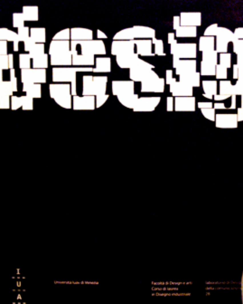
portfolio annalaura tezzon
DESCRIPTION
portfolio, web, corporate, designTRANSCRIPT
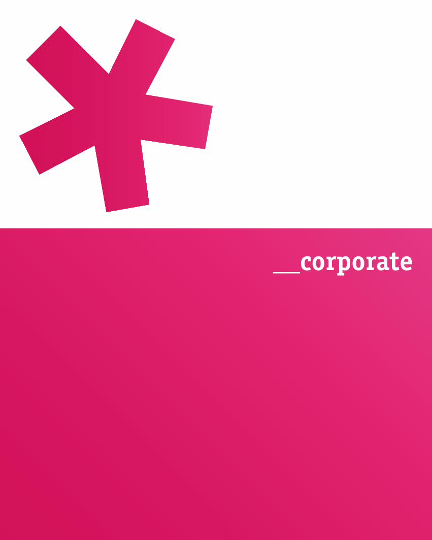
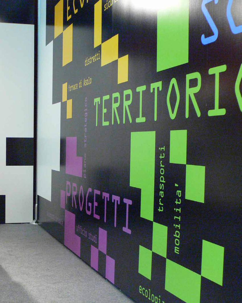
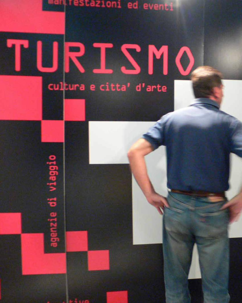
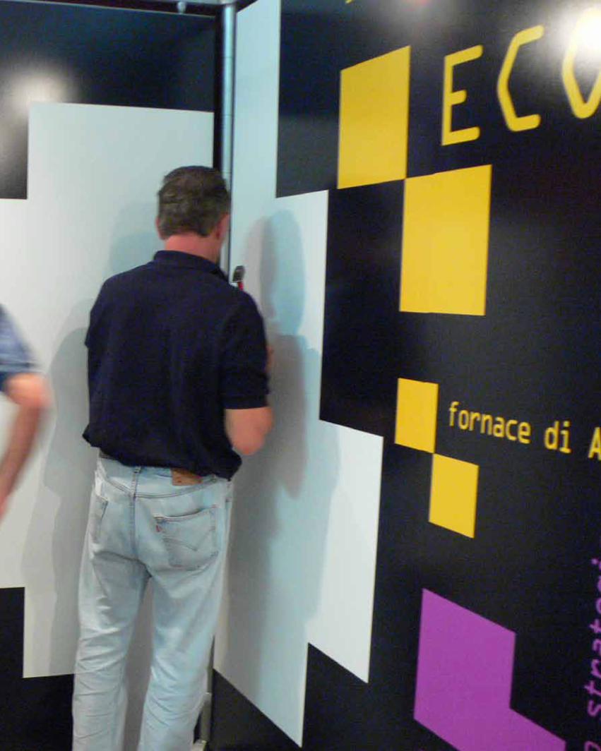
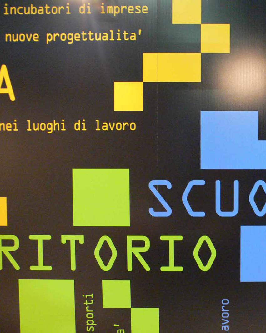
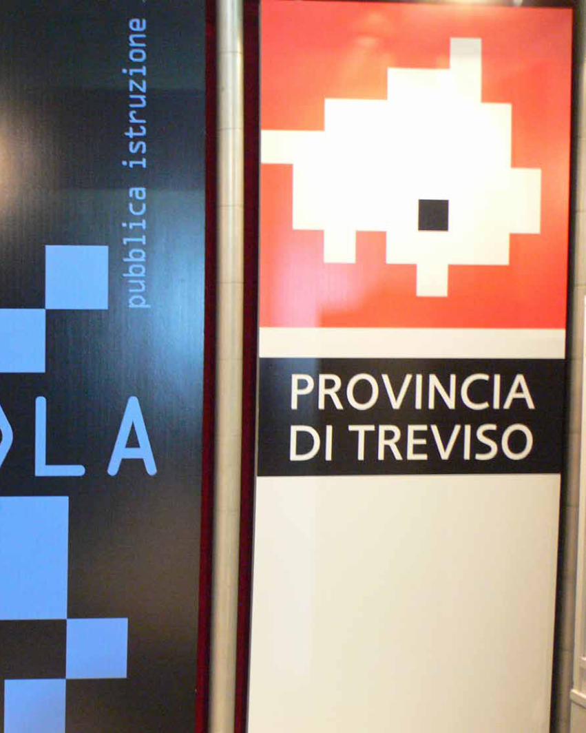
__corporate
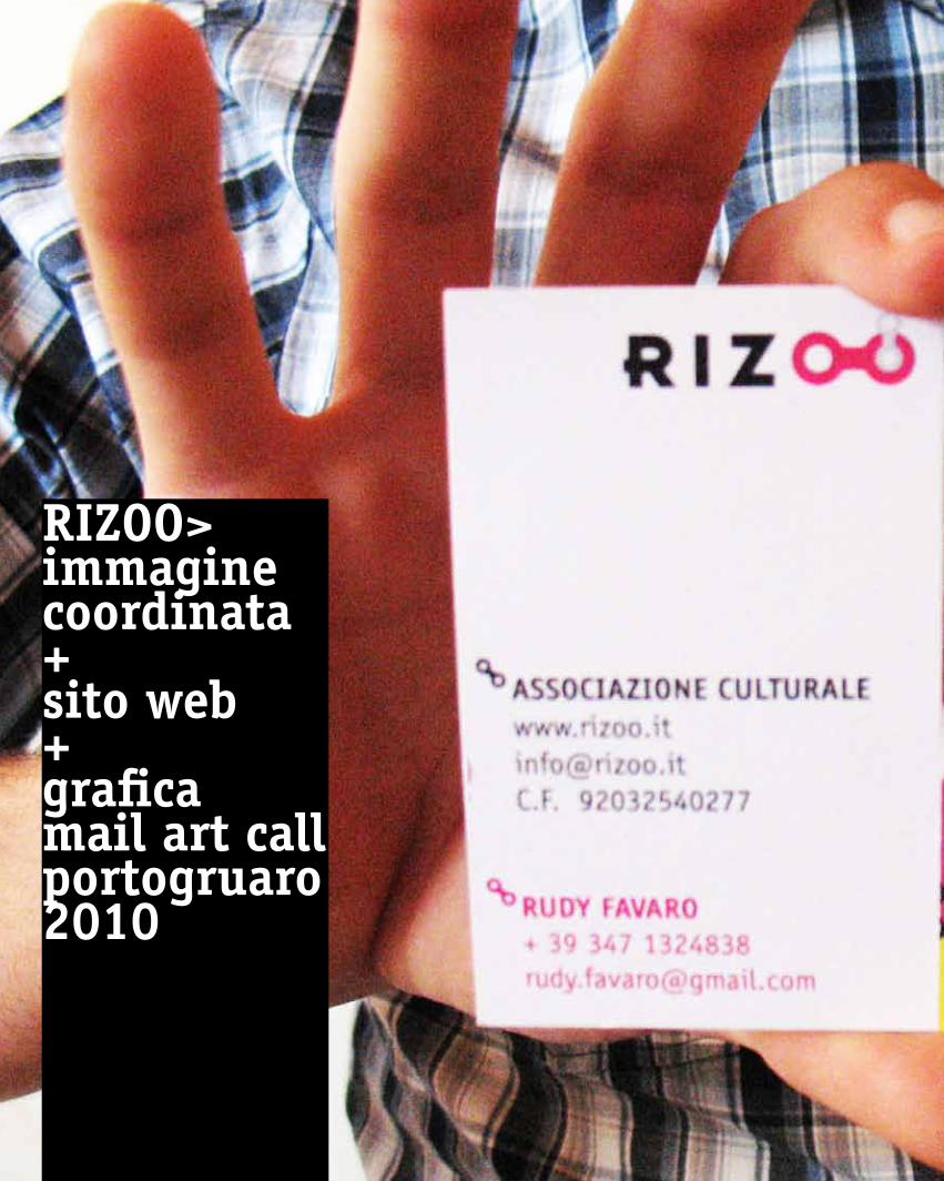
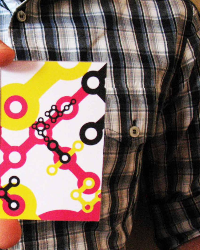
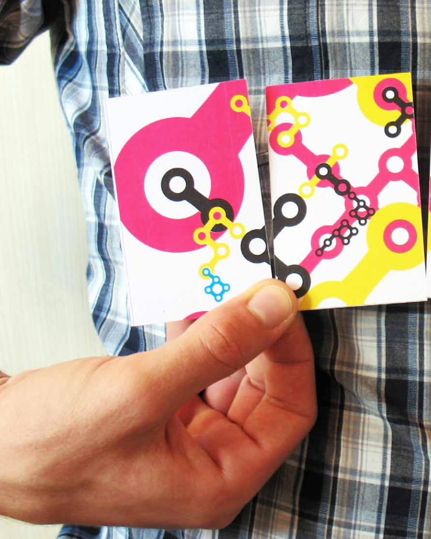
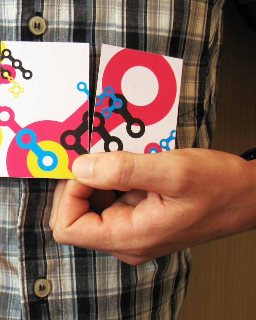
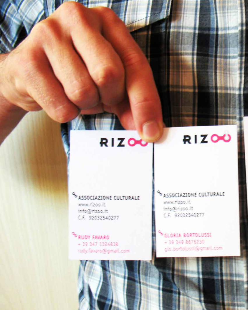
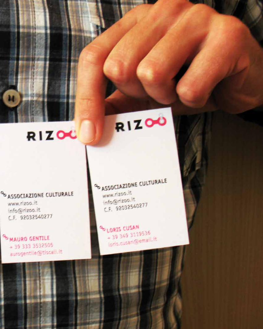
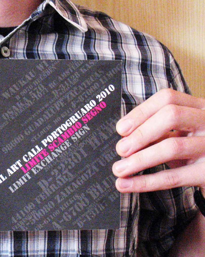
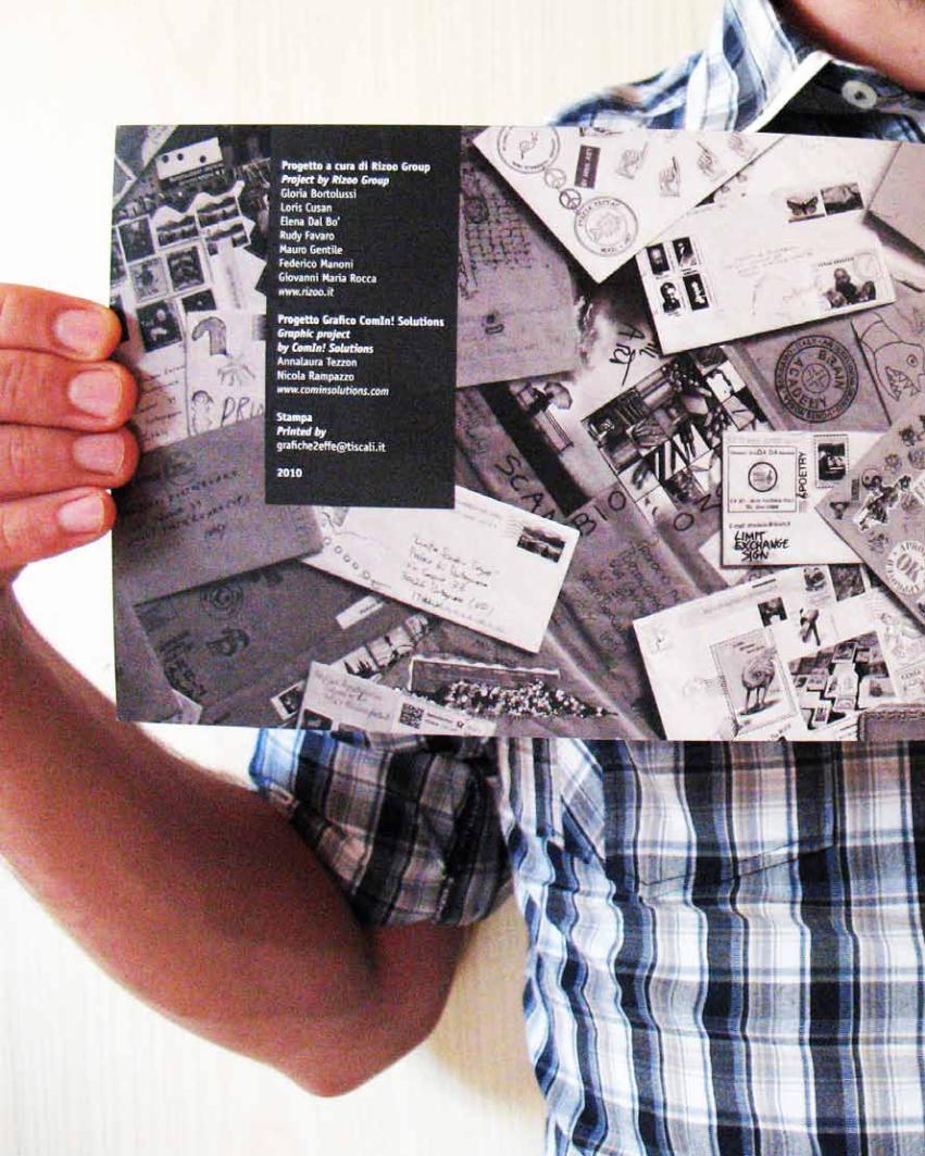
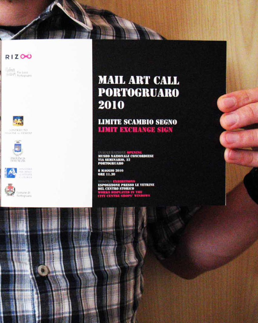
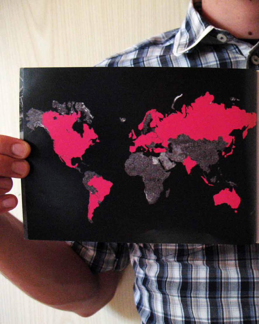
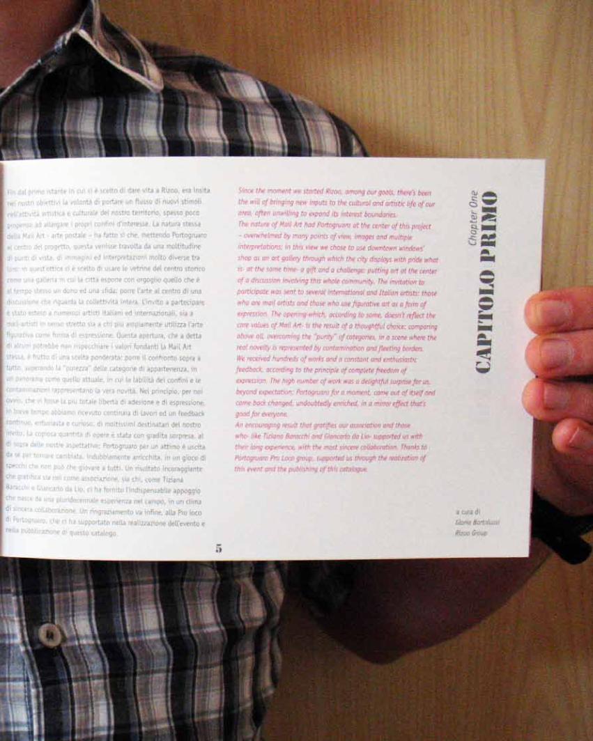
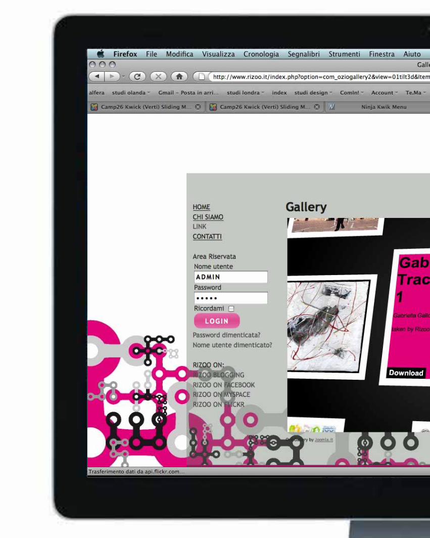
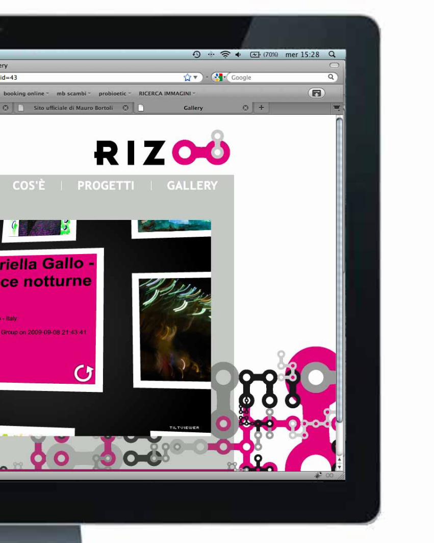
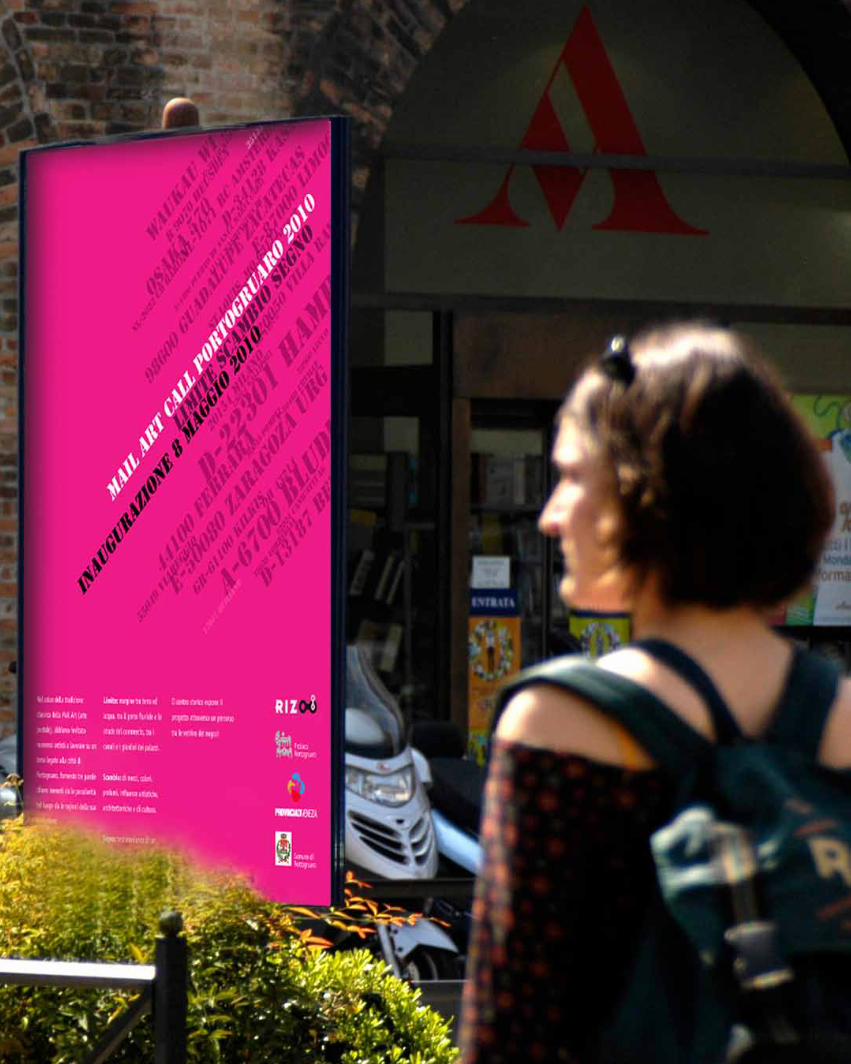
Rizoo>immaginecoordinata +sito web+graficamail art callportogruaro 2010
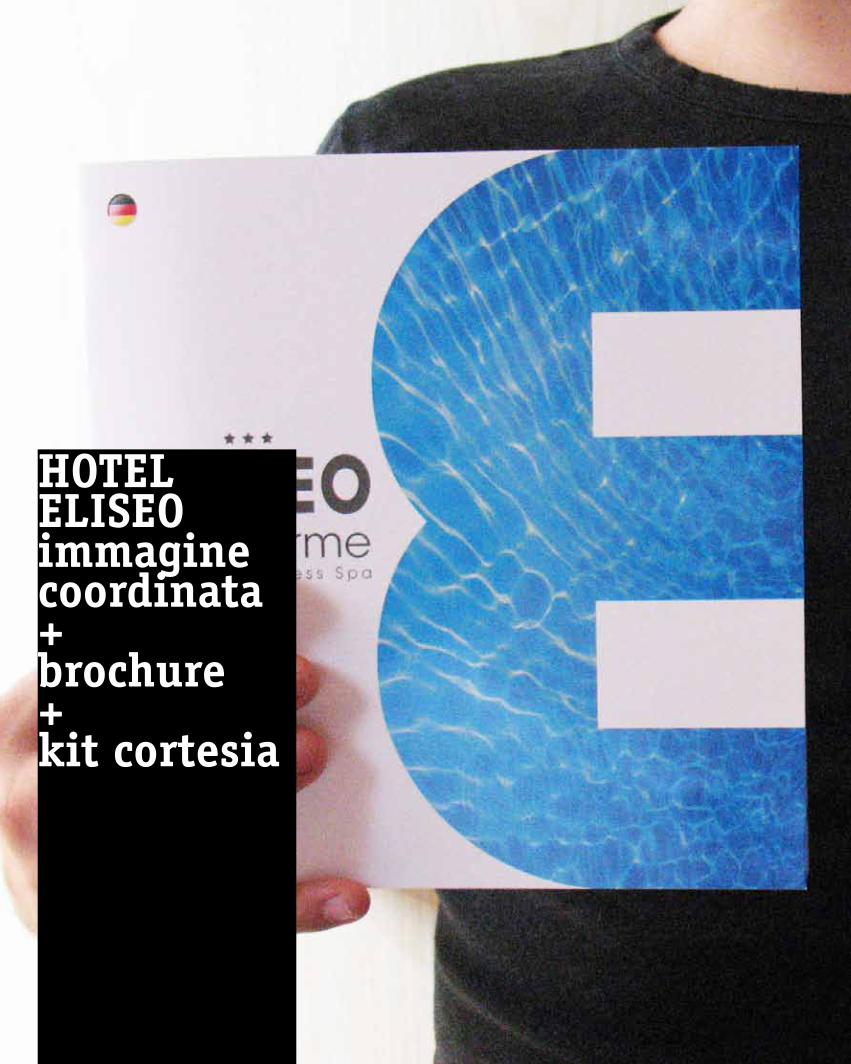
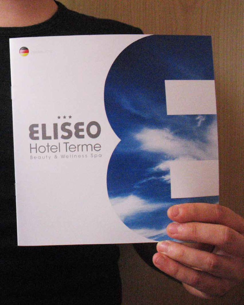
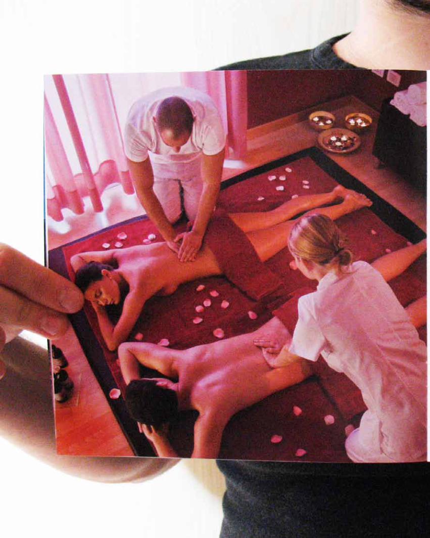
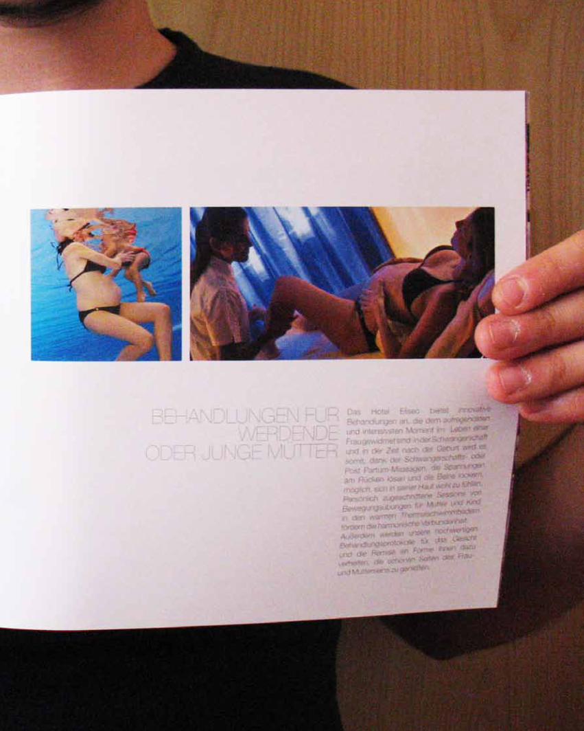
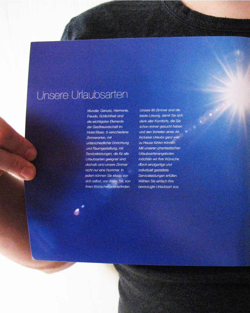
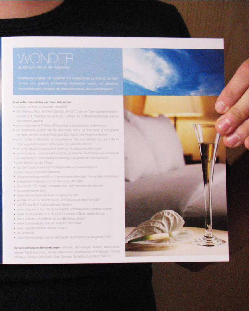
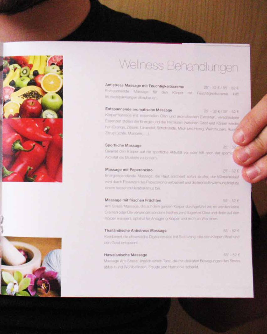
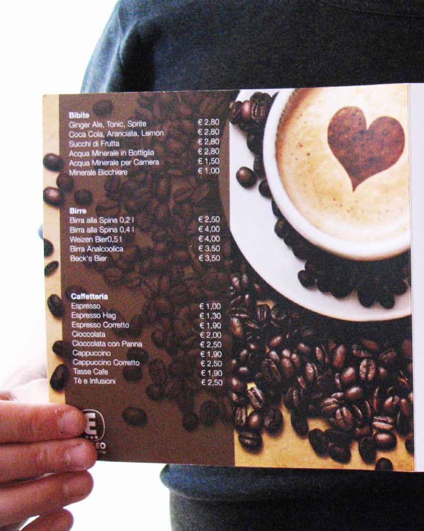
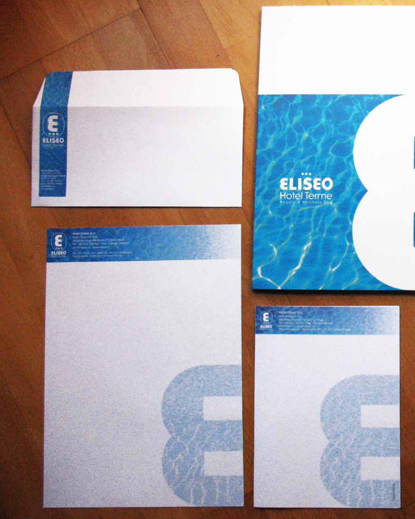
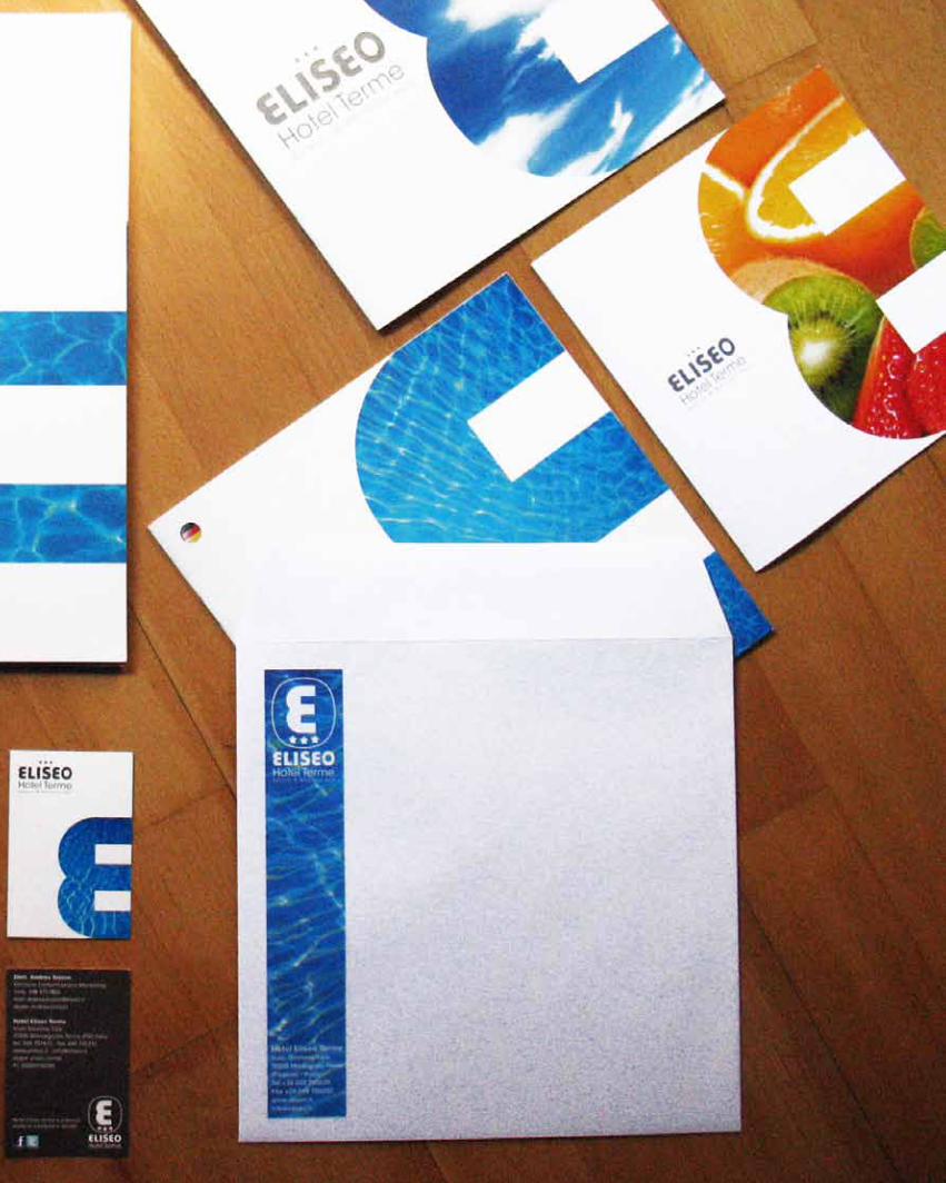
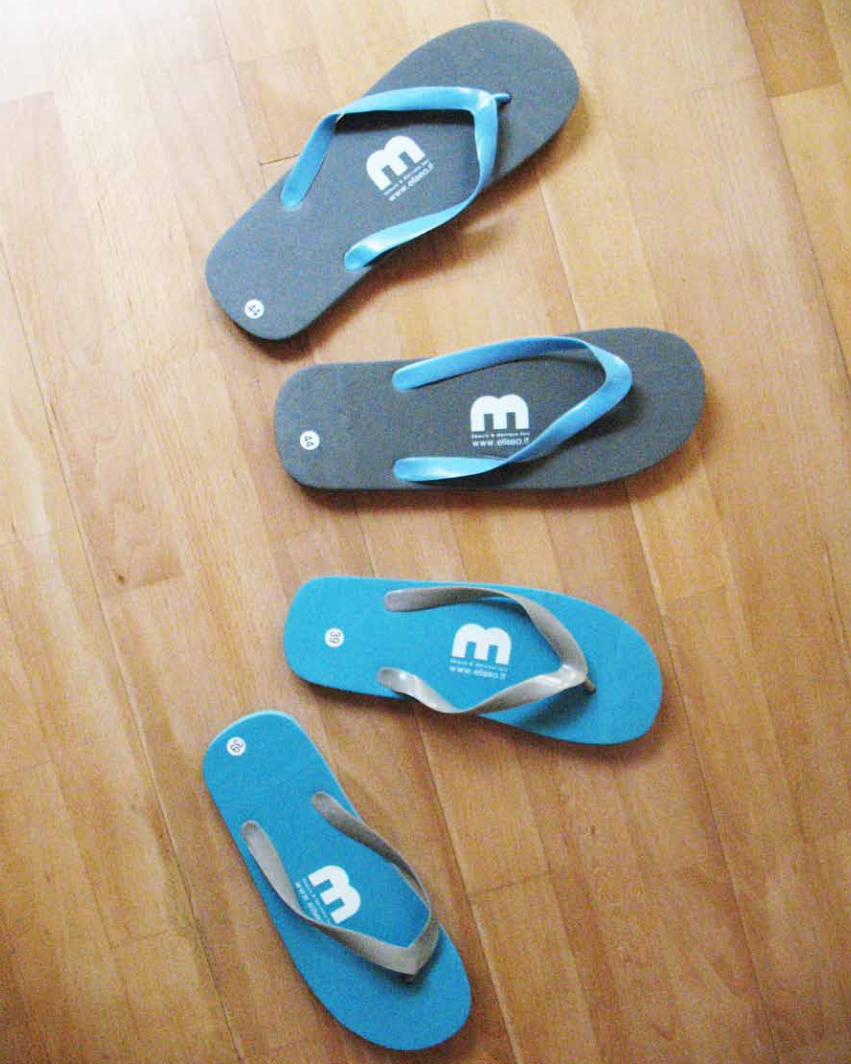
hoteleliseoimmaginecoordinata+brochure+kit cortesia


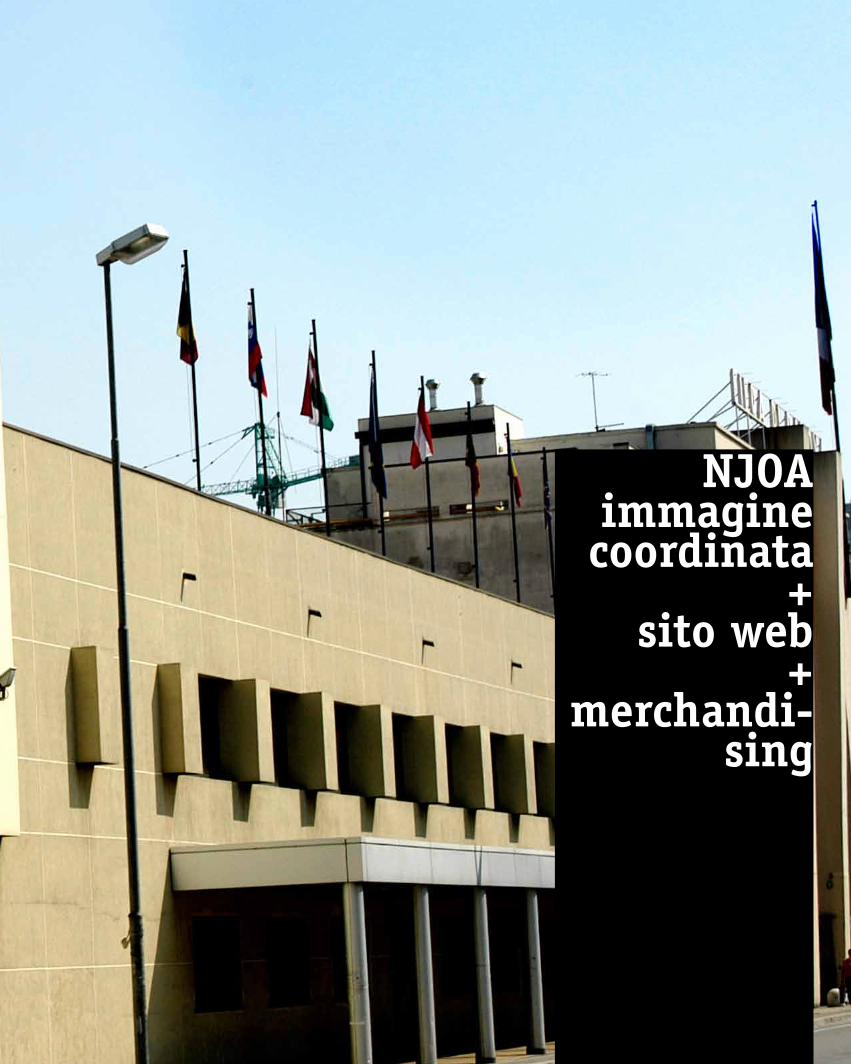
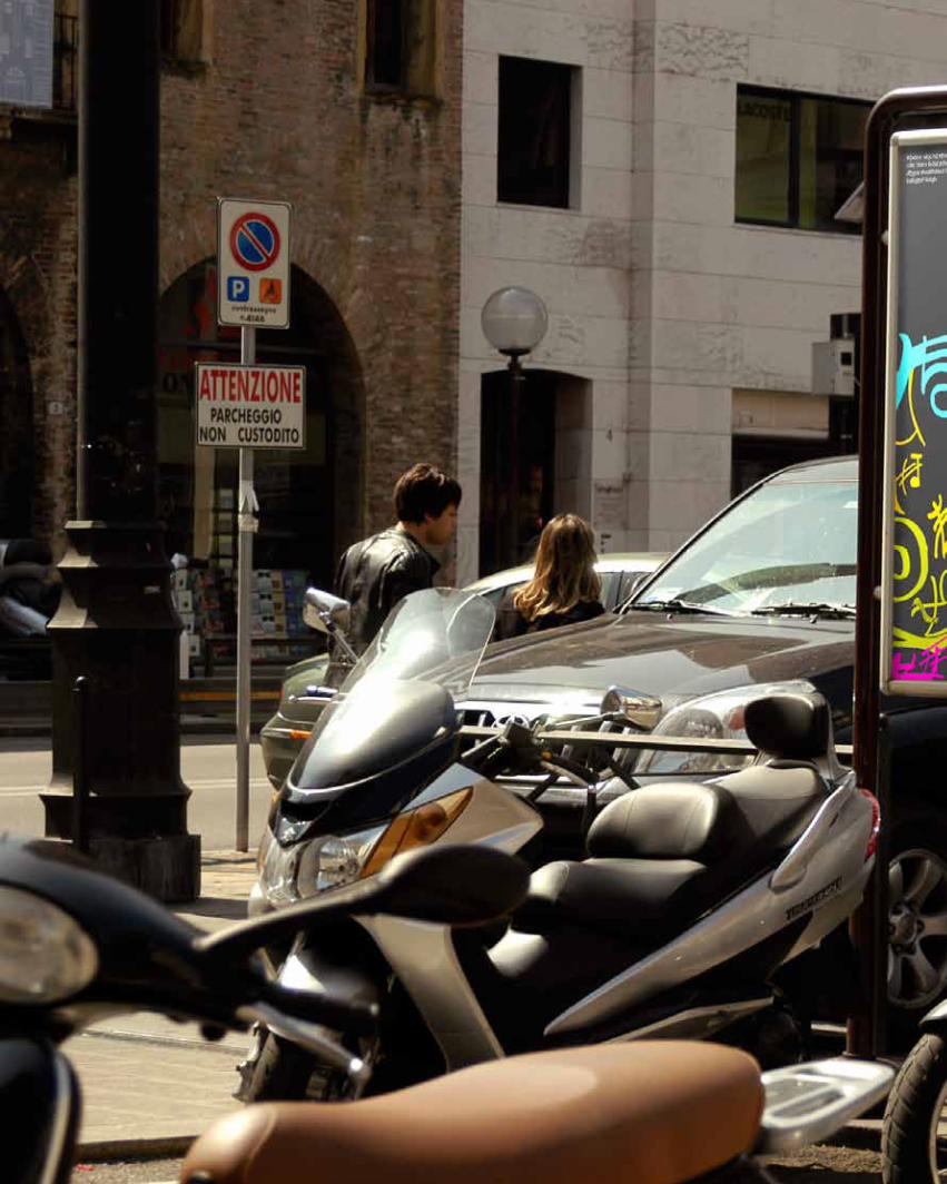
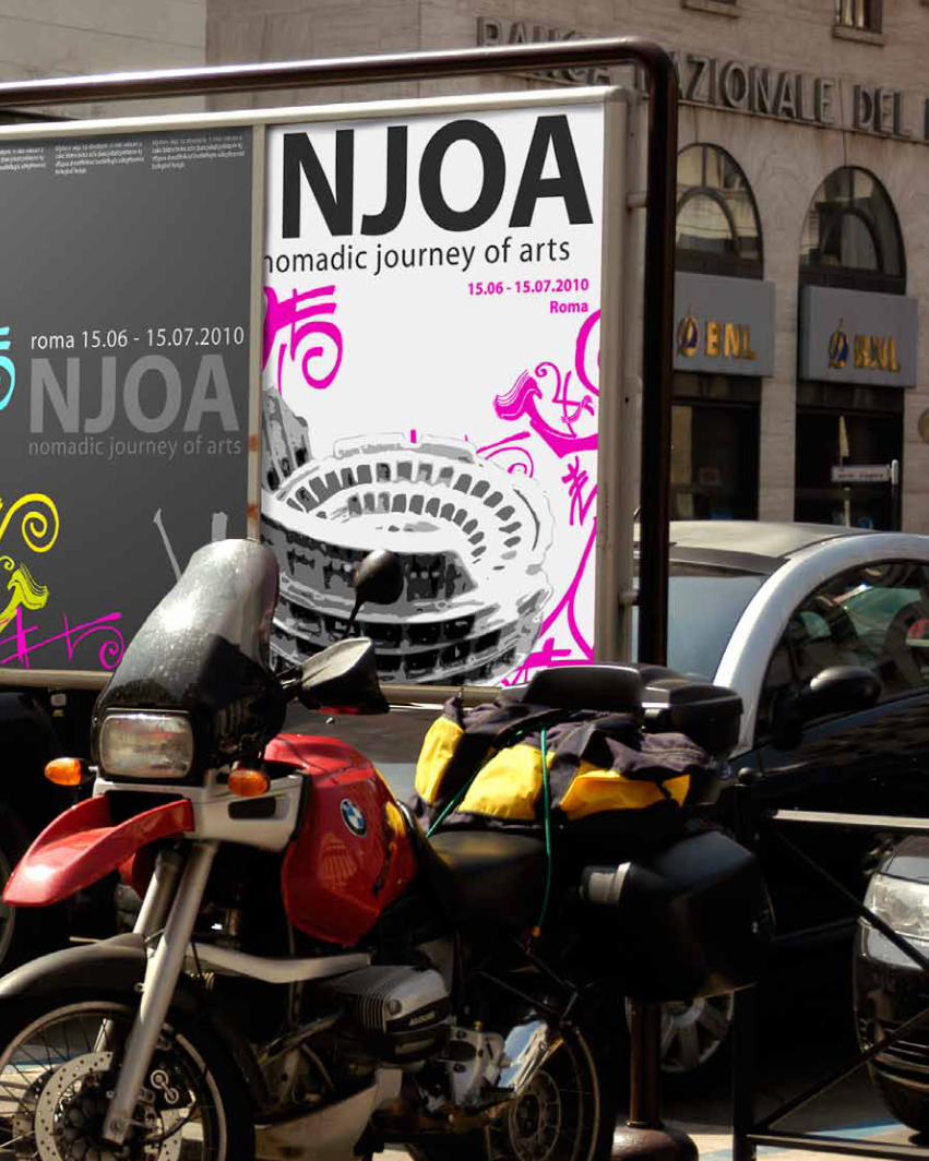
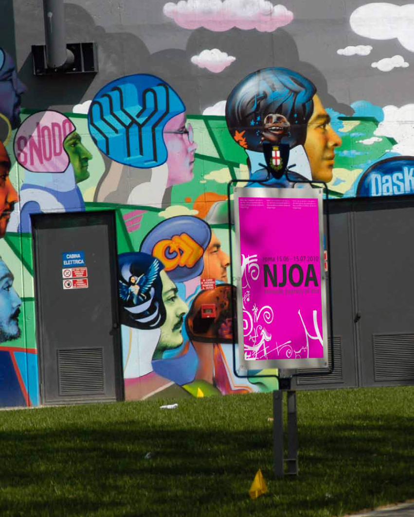
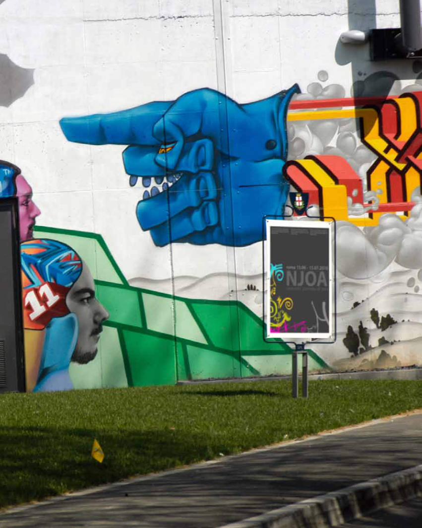
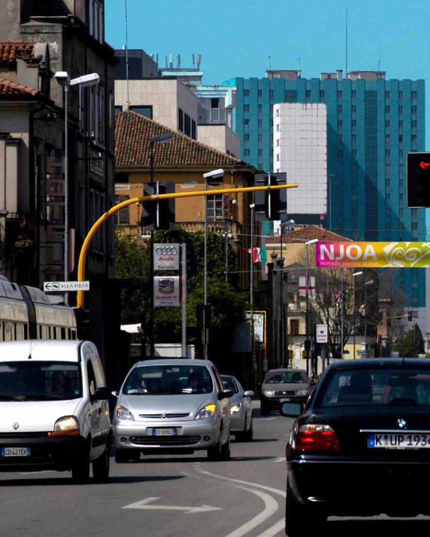
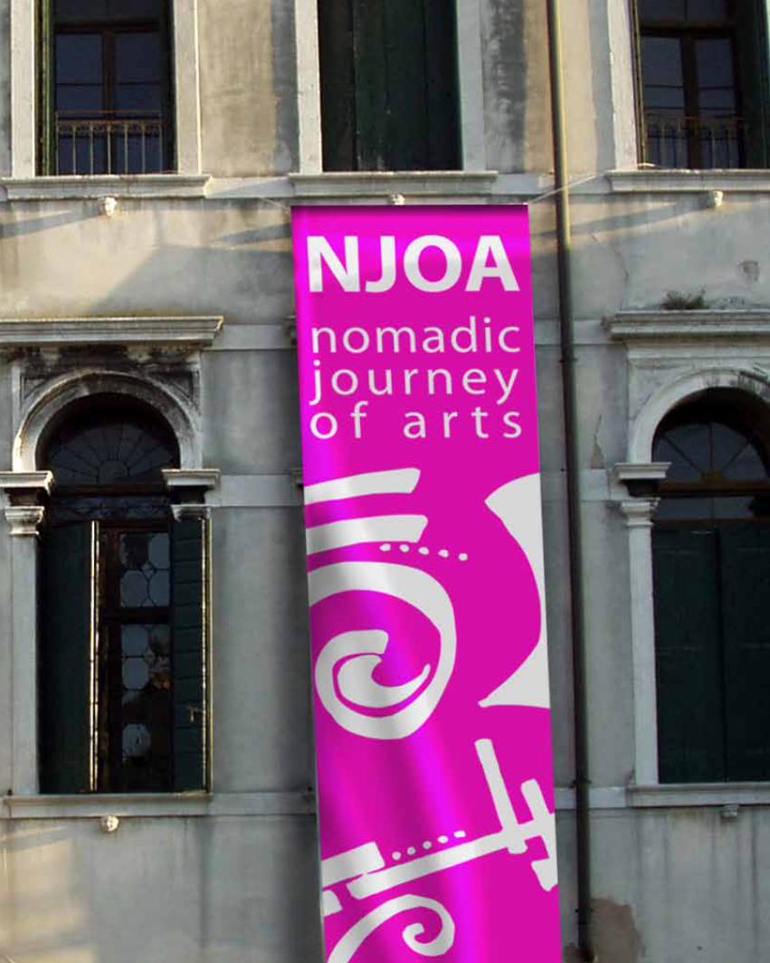
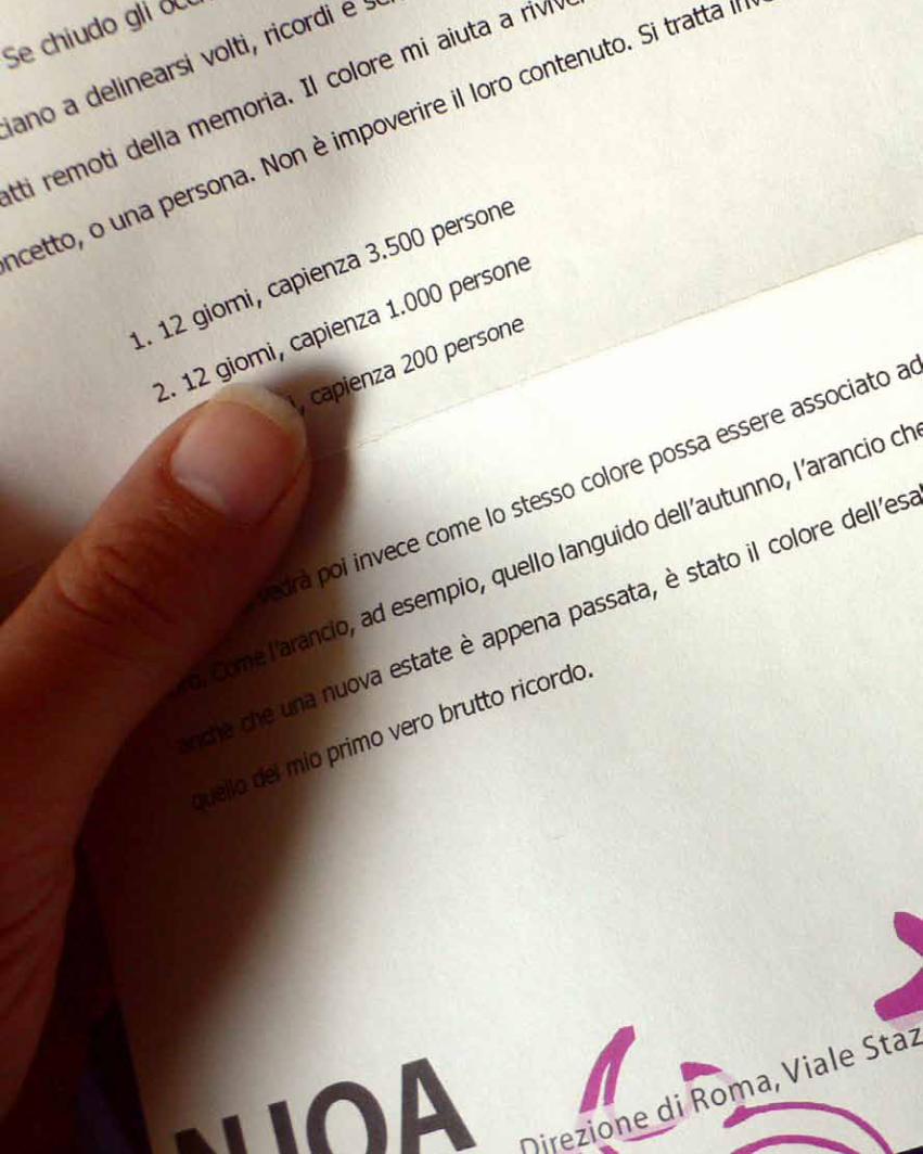
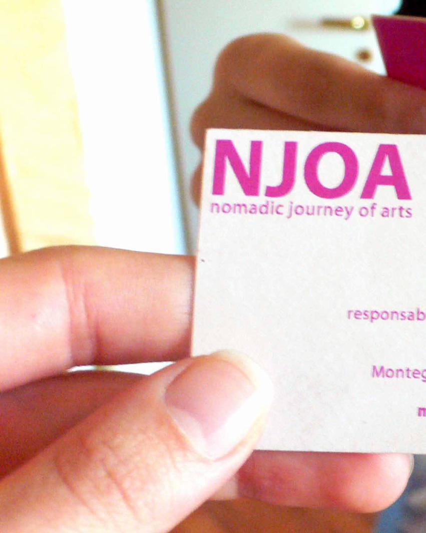
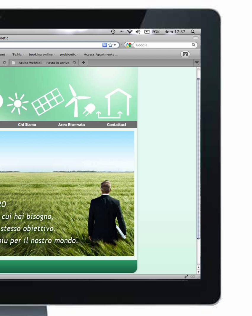
njoaimmaginecoordinata
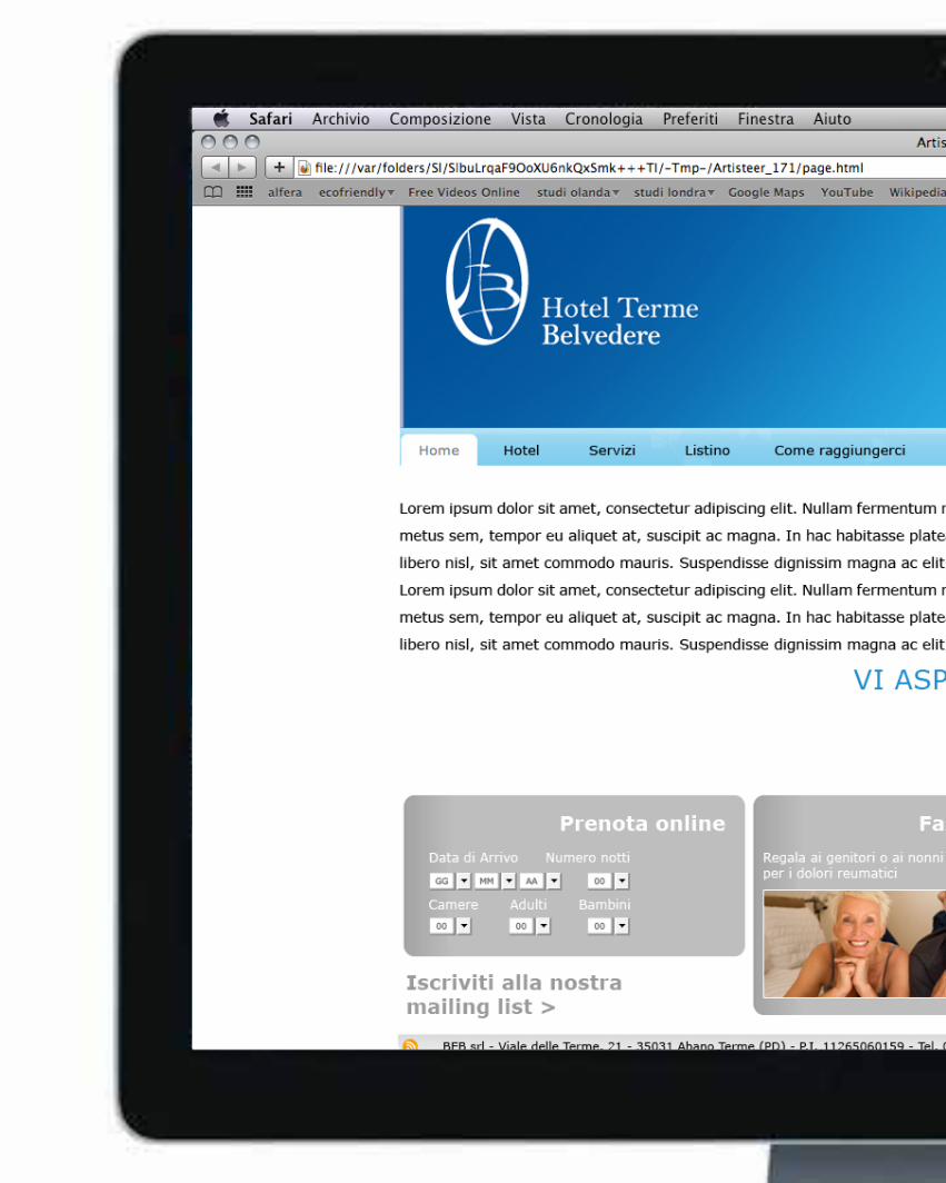
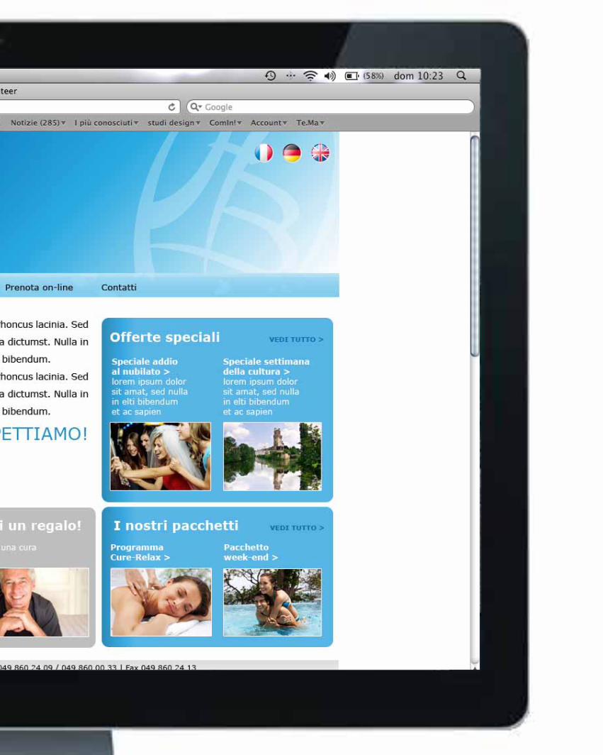
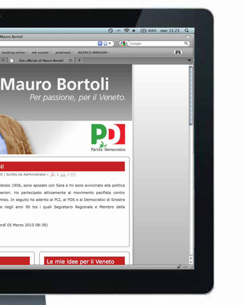
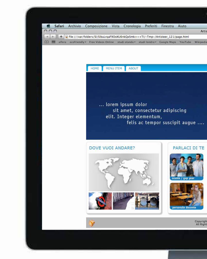
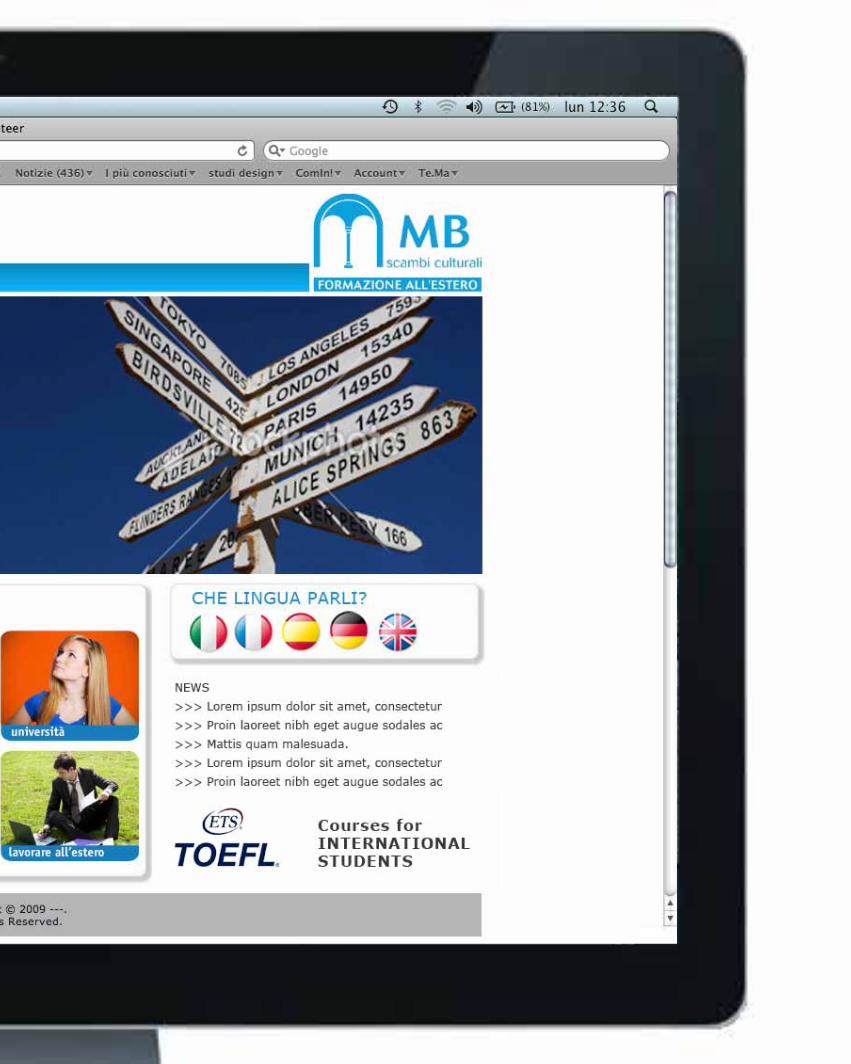
+ sito web
+merchandi-
sing

__web design

__poster design
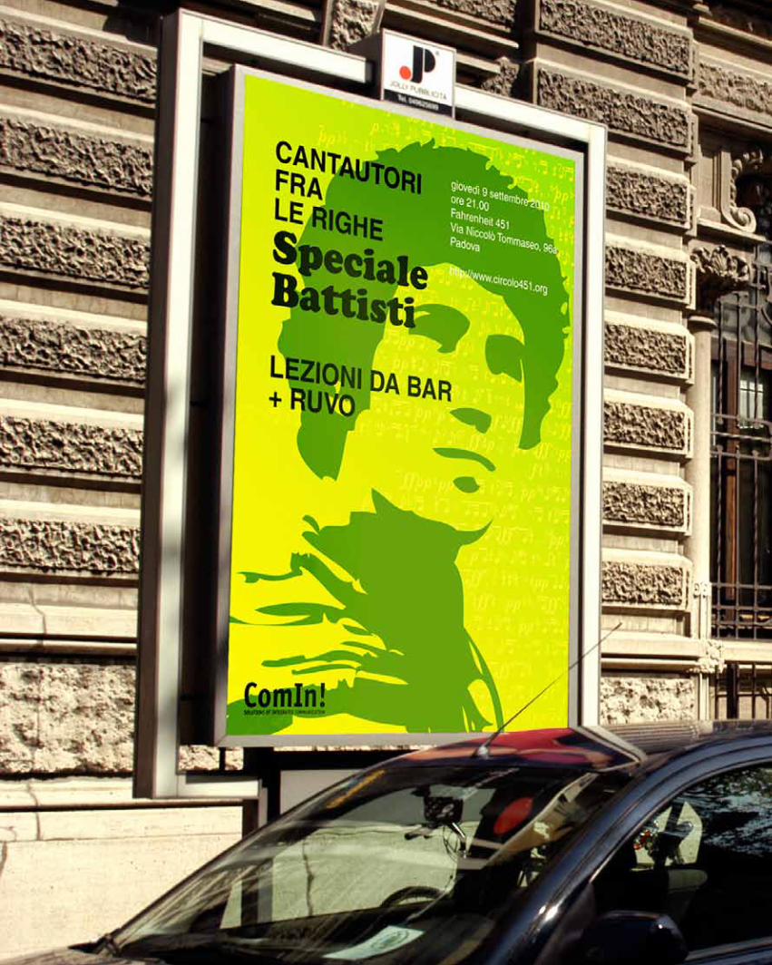
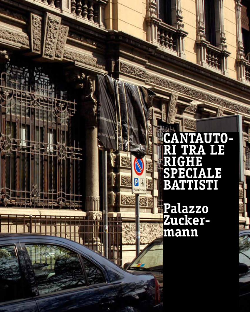
Cantautori tra le righe speciale battisti
28_09_10palazzo zuckermannpadova
Cantauto-Ri tRa le RighesPeCiale Battisti
Palazzozucker-mann
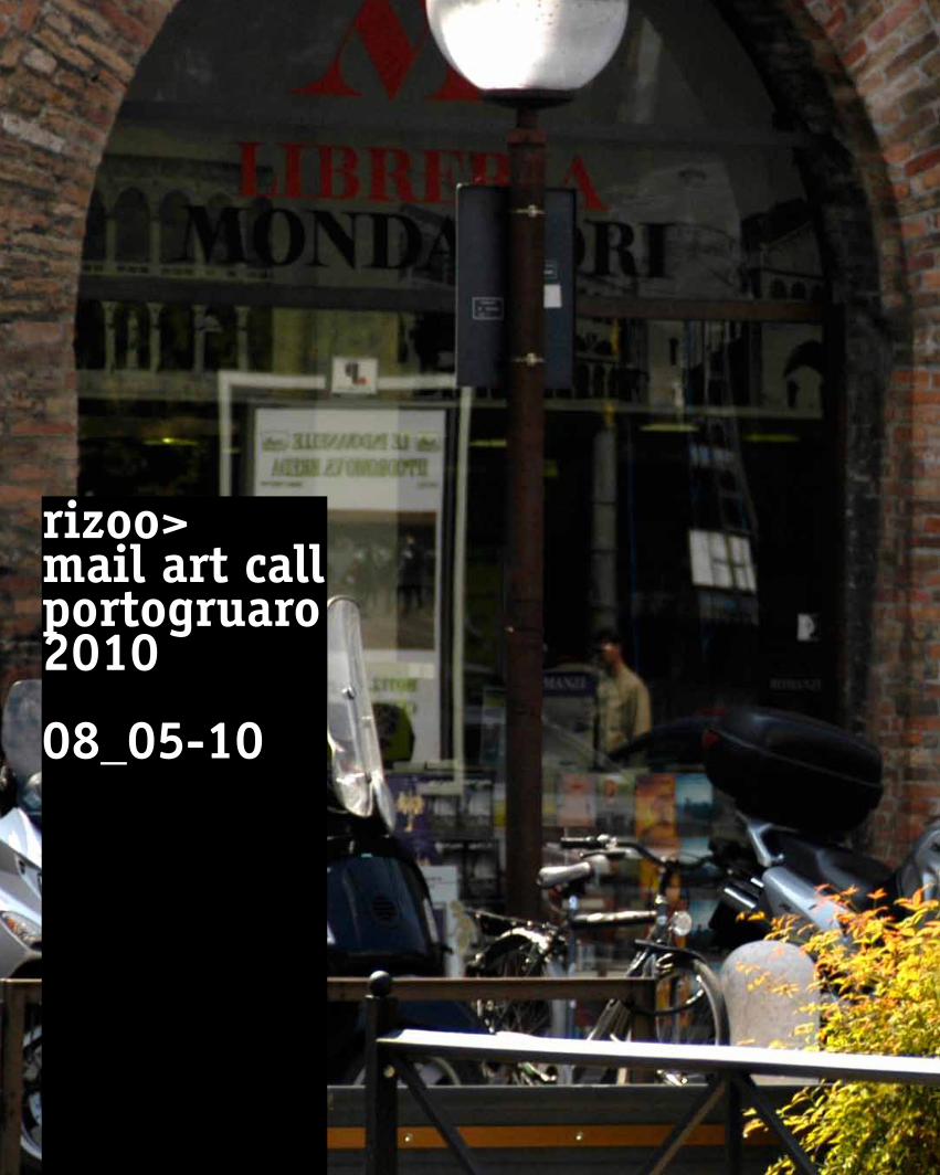
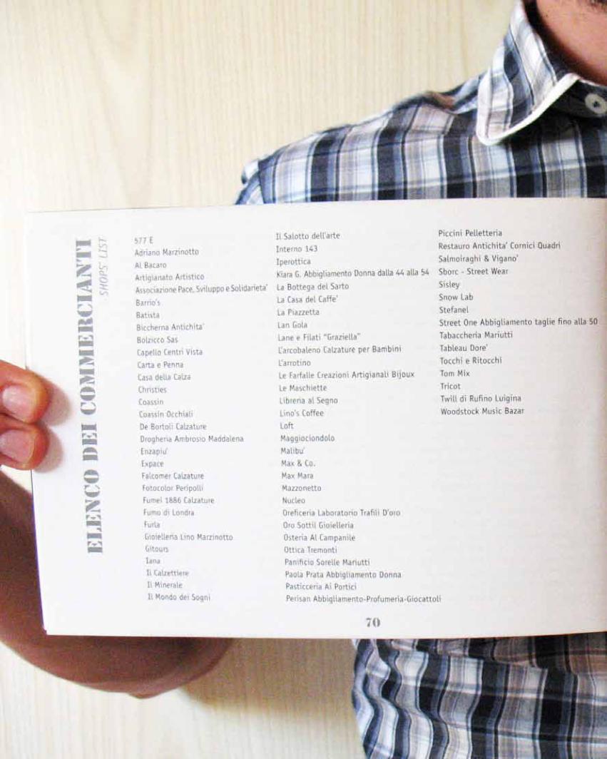
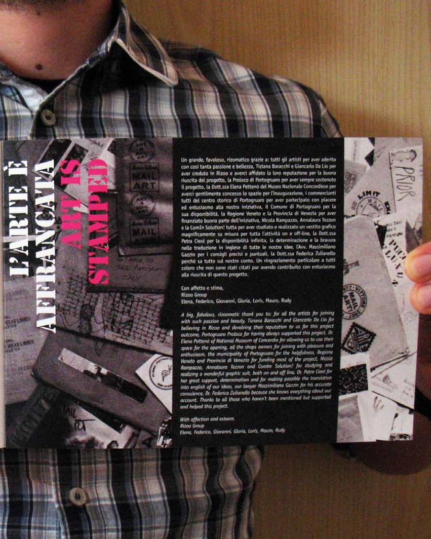
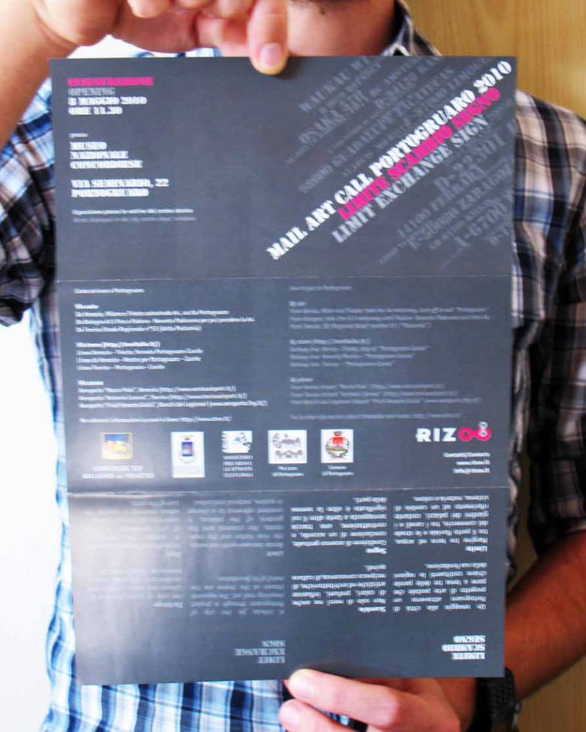
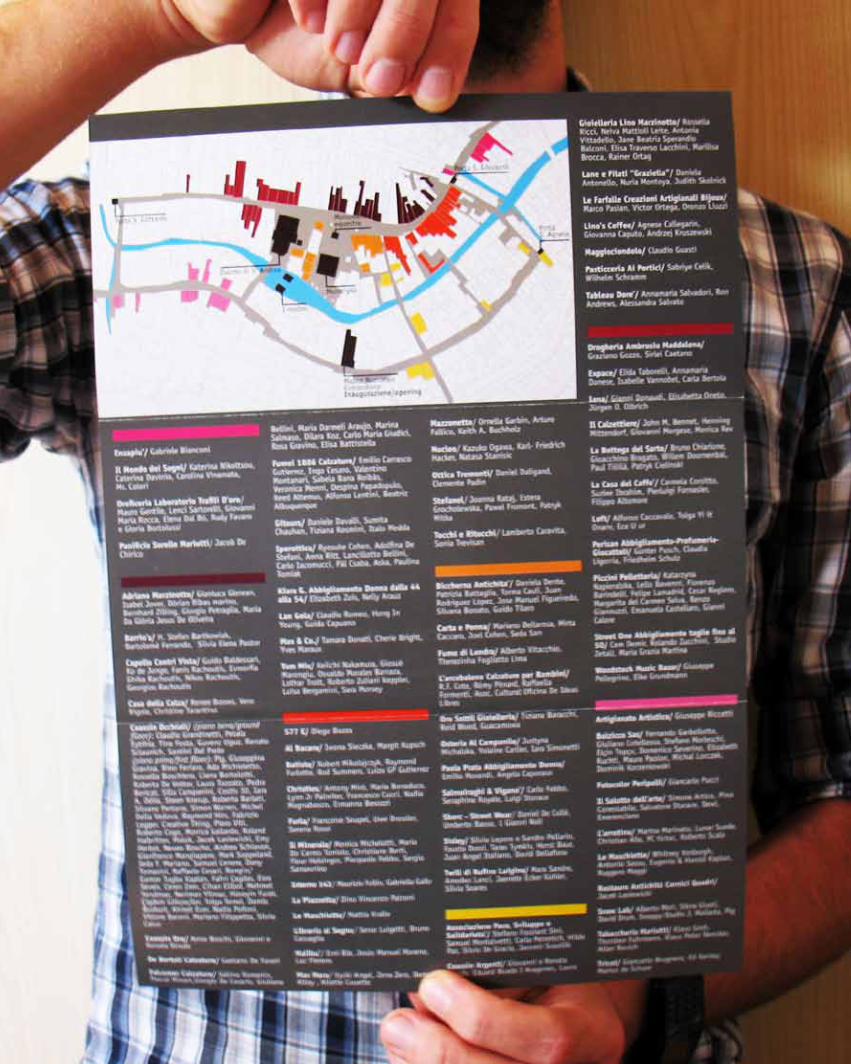
rizoo>mail art callportogruaro 2010
08_05-10
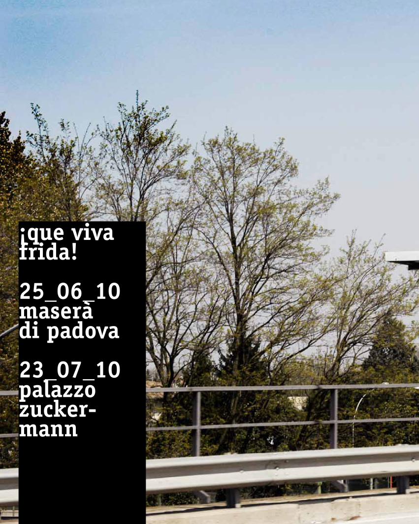
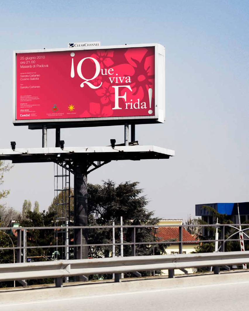
¡que viva frida!
25_06_10 maseràdi padova
23_07_10palazzo zucker-mann
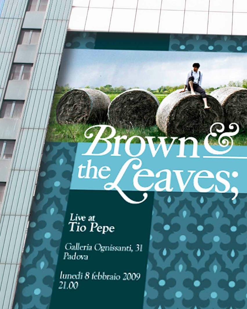
brown& the leaves
08_02_10tio pepe

__editorial design
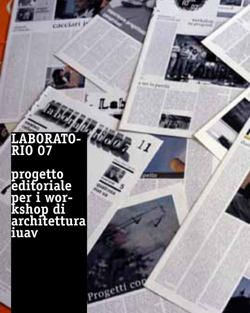
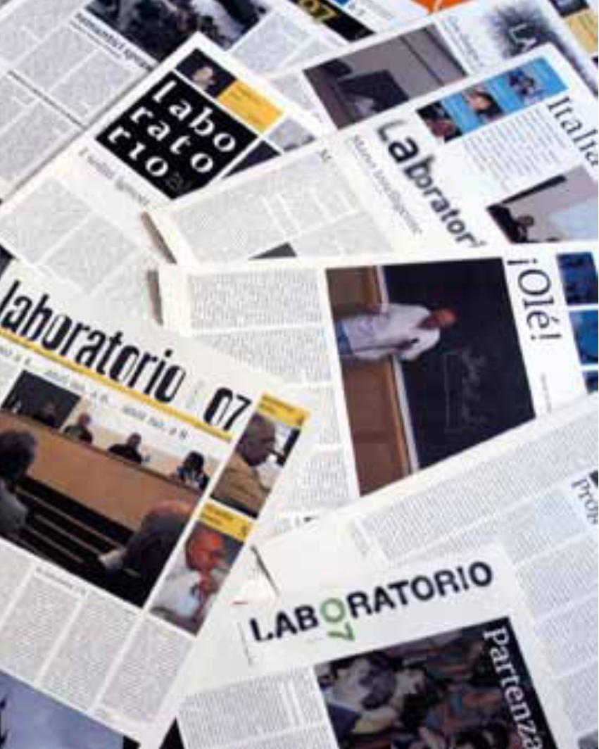
laBoRato-Rio 07
progettoeditorialeper i wor-kshop di architettura iuav
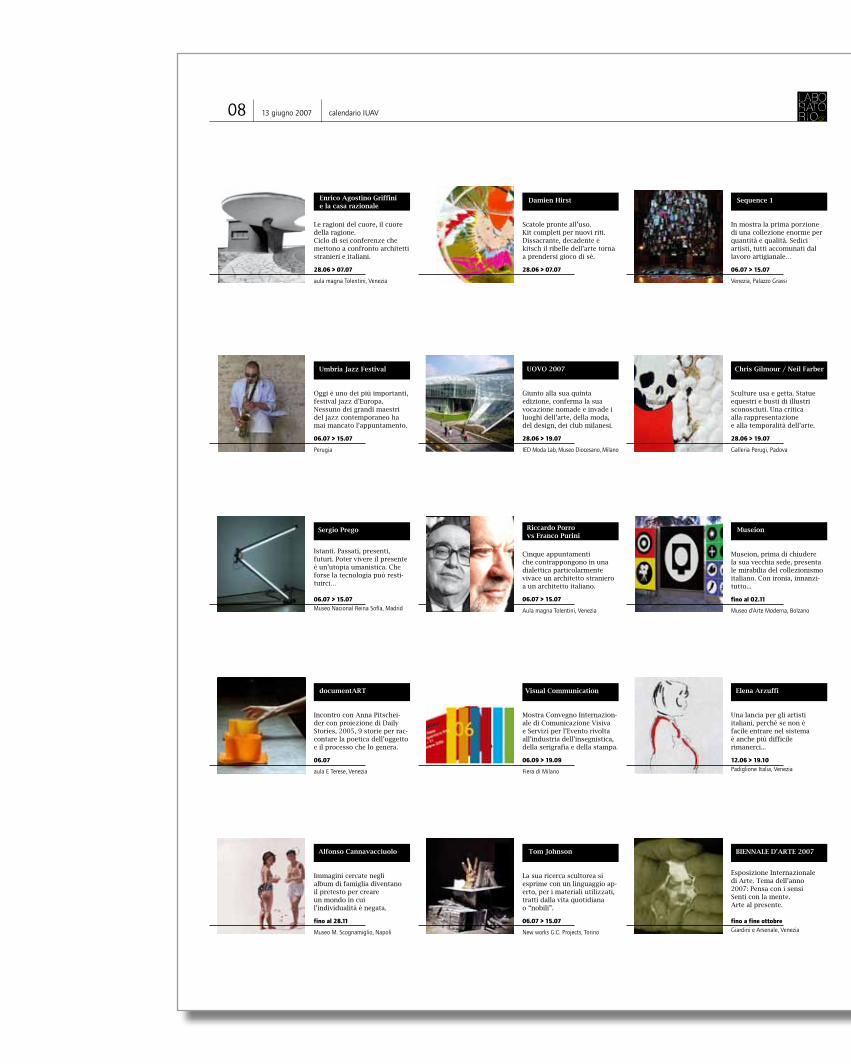
08 13 giugno 2007 calendario IUAV
Le ragioni del cuore, il cuore della ragione. Ciclo di sei conferenze che mettono a confronto architetti stranieri e italiani.
28.06 > 07.07
aula magna Tolentini, Venezia
Scatole pronte all’uso. Kit completi per nuovi riti. Dissacrante, decadente e kitsch il ribelle dell’arte torna a prendersi gioco di sè.
28.06 > 07.07
In mostra la prima porzione di una collezione enorme per quantità e qualità. Sedici artisti, tutti accomunati dal lavoro artigianale…
06.07 > 15.07
Venezia, Palazzo Grassi
Enrico Agostino Griffini e la casa razionale
Damien Hirst Sequence 1
Oggi è uno dei più importanti, festival jazz d’Europa.Nessuno dei grandi maestri del jazz contemporaneo ha mai mancato l’appuntamento.
06.07 > 15.07
Perugia
Giunto alla sua quinta edizione, conferma la sua vocazione nomade e invade i luoghi dell’arte, della moda, del design, dei club milanesi.
28.06 > 19.07
IED Moda Lab, Museo Diocesano, Milano
Sculture usa e getta. Statue equestri e busti di illustri sconosciuti. Una critica alla rappresentazione e alla temporalità dell’arte.
28.06 > 19.07
Galleria Perugi, Padova
Umbria Jazz Festival UOVO 2007 Chris Gilmour / Neil Farber
Istanti. Passati, presenti, futuri. Poter vivere il presente è un’utopia umanistica. Che forse la tecnologia può resti-tuirci…
06.07 > 15.07Museo Nacional Reina Sofía, Madrid
Museion, prima di chiudere la sua vecchia sede, presenta le mirabilia del collezionismo italiano. Con ironia, innanzi-tutto...
fino al 02.11
Museo d’Arte Moderna, Bolzano
Cinque appuntamenti che contrappongono in una dialettica particolarmente vivace un architetto straniero a un architetto italiano.
06.07 > 15.07
Aula magna Tolentini, Venezia
Sergio Prego Riccardo Porro vs Franco Purini
Museion
documentArt
Università Iuav di VeneziaFacoltà di Design e ArtiDipartimento delle arti e del disegno industrialeDottorato di teorie e storia delle artiCorso di laurea specialistica in progettazione e produzione delle arti visive
cinema & designincontro con
ANNA PITSCHEIDERcon proiezione di Daily Stories, 2005, 9 storie per raccontarela poetica dell’oggetto e il processo che lo genera
venerdì 29 giugno 2007, ore 11 aula ecorso di storia del cinema, Antonio CostaTerese, S. MartaDorsoduro 2206Venezia
Incontro con Anna Pitschei-der con proiezione di Daily Stories, 2005, 9 storie per rac-contare la poetica dell’oggetto e il processo che lo genera.
06.07
aula E Terese, Venezia
Mostra Convegno Internazion-ale di Comunicazione Visiva e Servizi per l’Evento rivolta all’industria dell’insegnistica, della serigrafia e della stampa.
06.09 > 19.09
Fiera di Milano
Una lancia per gli artisti italiani, perché se non è facile entrare nel sistema è anche più difficile rimanerci...
12.06 > 19.10Padiglione Italia, Venezia
documentART Visual Communication Elena Arzuffi
Immagini cercate negli album di famiglia diventano il pretesto per creare un mondo in cui l’individualità è negata.
fino al 28.11
Museo M. Scognamiglio, Napoli
La sua ricerca scultorea si esprime con un linguaggio ap-erto, per i materiali utilizzati, tratti dalla vita quotidiana o “nobili”.
06.07 > 15.07
New works G.C. Projects, Torino
Alfonso Cannavacciuolo Tom Johnson
Esposizione Internazionale di Arte. Tema dell’anno 2007: Pensa con i sensi Senti con la mente. Arte al presente.
fino a fine ottobreGiardini e Arsenale, Venezia
BIENNALE D’ARTE 2007
With all the confusion in these early days of formulating theoretical paradigms, it is understandable why some de-signers have given up trying to connect their practice to con-temporary theory. By the time postmodernism came along, many designers were quite happy to dismiss it as a trendy
fad or irrelevant rambling, and be done with it. That is exactly why I think it is important to examine some of the connec-tions between the postmodern condition and graphic design. Although there has always been some confusion about what postmodernism is, the most obvious feature is that it
is a reaction (not rejection), to the established forms of high Modernism. The second most prominent feature of post-modernism is the erasing of the boundaries between high culture and pop culture. But probably the most contested feature is that of “theoretical discourse,” where theory was
anno 1 numero 12 | 13 giugno 2007
Erik Spiekermann
no longer confined to philoso-phy, but incorporated history, social theory, political science, and many other areas of study, including design theory. Post-modernism is not a description of a style; it is the term for the era of late capitalism starting after the 1940’s and realized in the 1960’s with neo-colo-
Alla scuola del Libro della Soci-età Umanitaria, la rassegna di fine d’anno, serve come verifi-ca dell’attività svolta nel 1972-73 e come punto di partenza per precisare I programmi per l’anno successivo. Sulla base di esperienze verificate si con-stata che le case editrici, gli enti pubblici e sociali, richie-dono la collaborazione di gio-vani grafici che sappiano illus-trare libri di testo scolastici di varie materie, per esempio di fisica, chimica, di narrati-va, matematica, geografia, ecc. Giovani grafici che usciti oggi dalla scuola, siano sufficiente-
mente preparati per iniziare attività grafiche di cartogra-fia, simbologia, allestimenti semplici, visualizzazione sta-tistiche anche tridimension-ale, iconografia, impaginazi-one, modellistica, imballaggio editoriale, diffusione di cul-tura. La scuola del libro deve dare oggi una preparazione tecnica e culturale di base che permetta allo studente di in-iziare l’attività professionale che gli verrà richiesta (anche in un’agenzia pubblicitaria), ma sempre tenendo presente che la tecnica e la cultura per domani, per migliorare la soci-età nella quale viviamo, saran-no tecnica e cultura diversa dalla tecnica e dalla cultura che ha prodotto la società nel-la quale non ci riconosciamo idealmente. Si è già scritto molto sulle sulle nuove tecniche nel settore grafico. Certamente con gli at-tuali sistemi di composizione di riproduzione di stampa e di confezione, si raggiungono ti-rature e qualità altissime. (...)
SEGUE A PAG. 3
nialism, the green revolution, computerization and electronic information. Postmodernism didn’t have much impact on graphic design until the middle of the 1980s. Initially, many designers thought it was just undisciplined self-indulgence. A hodgepodge of styles, with no unifying ideals or formal vocabularies, dreamed up by students in the new graduate programs. But in fact it was a new way of thinking about de-sign, one that instigated a new way of designing. Designers began to realize that as media-tors of culture, they could no longer hide behind the “prob-lems” they were “solving.” One could describe this shift as a younger generation of design-ers simply indulging their egos and refusing to be transparent (like a crystal goblet). Or you could say they were acknowl-edging their unique position in the culture, one that could have any number of political or ideological agendas. The ver-nacular, high and low culture, pop culture, nostalgia, parody, irony, pastiche, deconstruc-tion, and the anti-aesthetic represent some of the ideas that have come out of the 80s and informed design practice and theory of the 90s. After the 80s designers may still choose to be anonymous, but they will never again be con-sidered invisible. We are part of the message in the media. In the postmodern era we are not just mediators of infor-mation, but individuals who think creatively and visually about our culture. In the late
80s, an anti-aesthetic impulse emerged in opposition to the canon of Modernist “good design.” It was a reaction to the narrow, formalist concerns of late Modernism. It staked a larger claim to the culture and expanded the expressive possibilities in design. The new aesthetic was impure, chaotic, irregular and crude. A point that was so successfully made, in terms of style, that pretty much everything was allowed in the professional-ized field of graphic design, and from then on typography would include the chaotic and circuitous as options in its lexicon of styles. In fact, most of the formal mannerisms of the late 80s have continued to predominate throughout the 90s. But now it’s no longer an ideologically relevant, or even new style - now it’s just the most popular commercial style. Resisting mainstream pop banality is an outdated attitude that only a few design-ers of my generation worry about anymore. Now most graphic designers need results fast; formal and conceptual innovations only slow down commercial accessibility. It is hard for a generation raised in a supposedly “alternative” youth culture, which put every kid from Toledo to Tokyo in the same baggy pants and t-shirt, to believe that relevant forms of expression can even exist outside of pop culture. Today’s young designers don’t worry (...)
SEGUE A PAG. 2
Oggi è già domaniDa “il mestiere del grafico” di Albe Steiner, 1972
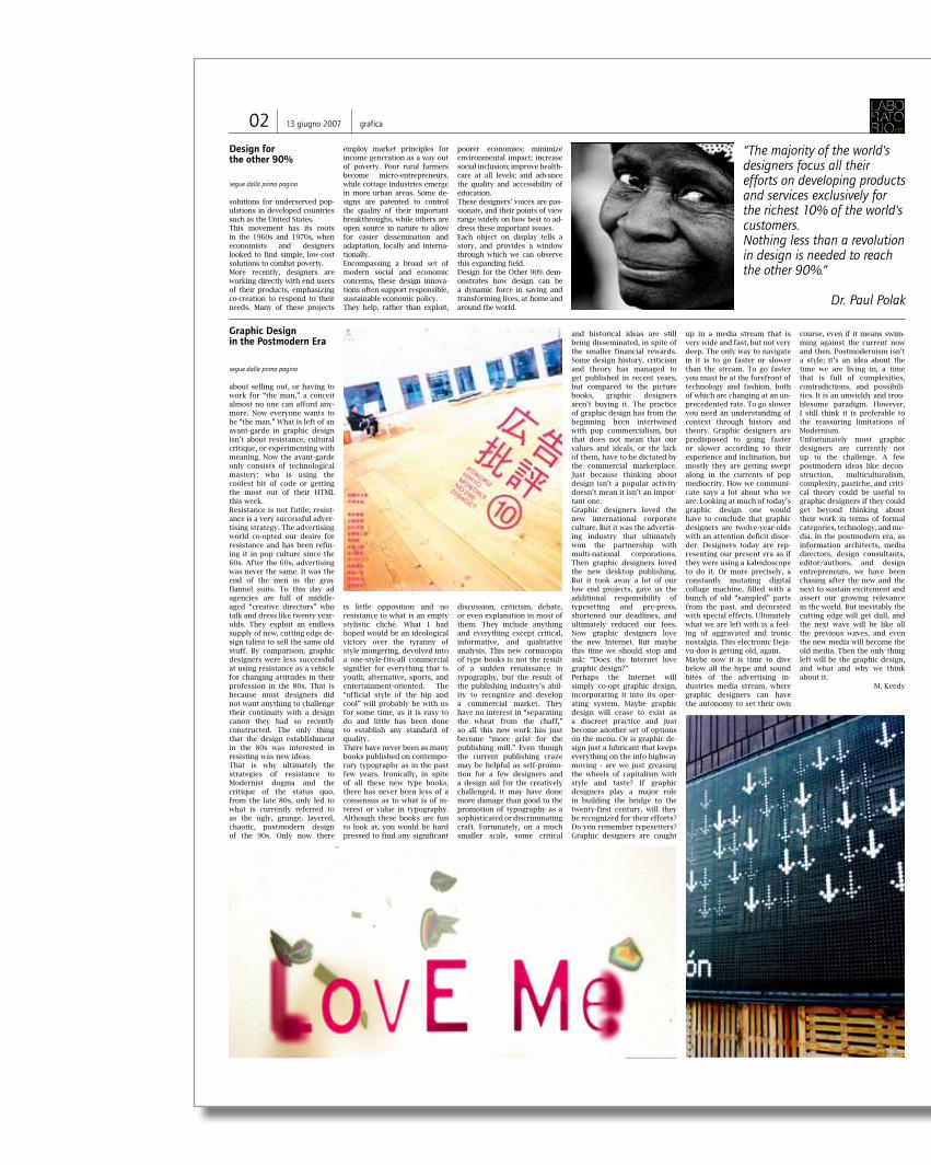
On view at Cooper-Hewitt, Na-tional Design Museum through September 23, 2007.Of the world’s total population of 6.5 billion, 5.8 billion peo-ple, or 90%, have little or no access to most of the products and services many of us take for granted; in fact, nearly half do not have regular access to food, clean water, or shelter. Design for the Other 90% ex-plores a growing movement among designers to design low-cost solutions for this “other 90%.” Through partnerships both local and global, individuals and organizations are finding
Design for the other 90%
unique ways to address the ba-sic challenges of survival and progress faced by the world’s poor and marginalized. Designers, engineers, students and professors, architects, and social entrepreneurs from all over the globe are devising cost-effective ways to increase access to food and water, en-ergy, education, healthcare, revenue-generating activities, and affordable transportation for those who most need them. And an increasing number of initiatives are providing solu-tion for understand (...)
SEGUE A PAG. 2
Graphic Design in the Postmodern Era
Forum 2004 - Habitar el Mon exhibition 3 - Base design studio
pag 4 - 5
Vince Frost
pag 6 - 7

08 13 giugno 2007 calendario IUAV
Le ragioni del cuore, il cuore della ragione. Ciclo di sei conferenze che mettono a confronto architetti stranieri e italiani.
28.06 > 07.07
aula magna Tolentini, Venezia
Scatole pronte all’uso. Kit completi per nuovi riti. Dissacrante, decadente e kitsch il ribelle dell’arte torna a prendersi gioco di sè.
28.06 > 07.07
In mostra la prima porzione di una collezione enorme per quantità e qualità. Sedici artisti, tutti accomunati dal lavoro artigianale…
06.07 > 15.07
Venezia, Palazzo Grassi
Enrico Agostino Griffini e la casa razionale
Damien Hirst Sequence 1
Oggi è uno dei più importanti, festival jazz d’Europa.Nessuno dei grandi maestri del jazz contemporaneo ha mai mancato l’appuntamento.
06.07 > 15.07
Perugia
Giunto alla sua quinta edizione, conferma la sua vocazione nomade e invade i luoghi dell’arte, della moda, del design, dei club milanesi.
28.06 > 19.07
IED Moda Lab, Museo Diocesano, Milano
Sculture usa e getta. Statue equestri e busti di illustri sconosciuti. Una critica alla rappresentazione e alla temporalità dell’arte.
28.06 > 19.07
Galleria Perugi, Padova
Umbria Jazz Festival UOVO 2007 Chris Gilmour / Neil Farber
Istanti. Passati, presenti, futuri. Poter vivere il presente è un’utopia umanistica. Che forse la tecnologia può resti-tuirci…
06.07 > 15.07Museo Nacional Reina Sofía, Madrid
Museion, prima di chiudere la sua vecchia sede, presenta le mirabilia del collezionismo italiano. Con ironia, innanzi-tutto...
fino al 02.11
Museo d’Arte Moderna, Bolzano
Cinque appuntamenti che contrappongono in una dialettica particolarmente vivace un architetto straniero a un architetto italiano.
06.07 > 15.07
Aula magna Tolentini, Venezia
Sergio Prego Riccardo Porro vs Franco Purini
Museion
documentArt
Università Iuav di VeneziaFacoltà di Design e ArtiDipartimento delle arti e del disegno industrialeDottorato di teorie e storia delle artiCorso di laurea specialistica in progettazione e produzione delle arti visive
cinema & designincontro con
ANNA PITSCHEIDERcon proiezione di Daily Stories, 2005, 9 storie per raccontarela poetica dell’oggetto e il processo che lo genera
venerdì 29 giugno 2007, ore 11 aula ecorso di storia del cinema, Antonio CostaTerese, S. MartaDorsoduro 2206Venezia
Incontro con Anna Pitschei-der con proiezione di Daily Stories, 2005, 9 storie per rac-contare la poetica dell’oggetto e il processo che lo genera.
06.07
aula E Terese, Venezia
Mostra Convegno Internazion-ale di Comunicazione Visiva e Servizi per l’Evento rivolta all’industria dell’insegnistica, della serigrafia e della stampa.
06.09 > 19.09
Fiera di Milano
Una lancia per gli artisti italiani, perché se non è facile entrare nel sistema è anche più difficile rimanerci...
12.06 > 19.10Padiglione Italia, Venezia
documentART Visual Communication Elena Arzuffi
Immagini cercate negli album di famiglia diventano il pretesto per creare un mondo in cui l’individualità è negata.
fino al 28.11
Museo M. Scognamiglio, Napoli
La sua ricerca scultorea si esprime con un linguaggio ap-erto, per i materiali utilizzati, tratti dalla vita quotidiana o “nobili”.
06.07 > 15.07
New works G.C. Projects, Torino
Alfonso Cannavacciuolo Tom Johnson
Esposizione Internazionale di Arte. Tema dell’anno 2007: Pensa con i sensi Senti con la mente. Arte al presente.
fino a fine ottobreGiardini e Arsenale, Venezia
BIENNALE D’ARTE 2007
With all the confusion in these early days of formulating theoretical paradigms, it is understandable why some de-signers have given up trying to connect their practice to con-temporary theory. By the time postmodernism came along, many designers were quite happy to dismiss it as a trendy
fad or irrelevant rambling, and be done with it. That is exactly why I think it is important to examine some of the connec-tions between the postmodern condition and graphic design. Although there has always been some confusion about what postmodernism is, the most obvious feature is that it
is a reaction (not rejection), to the established forms of high Modernism. The second most prominent feature of post-modernism is the erasing of the boundaries between high culture and pop culture. But probably the most contested feature is that of “theoretical discourse,” where theory was
anno 1 numero 12 | 13 giugno 2007
Erik Spiekermann
no longer confined to philoso-phy, but incorporated history, social theory, political science, and many other areas of study, including design theory. Post-modernism is not a description of a style; it is the term for the era of late capitalism starting after the 1940’s and realized in the 1960’s with neo-colo-
Alla scuola del Libro della Soci-età Umanitaria, la rassegna di fine d’anno, serve come verifi-ca dell’attività svolta nel 1972-73 e come punto di partenza per precisare I programmi per l’anno successivo. Sulla base di esperienze verificate si con-stata che le case editrici, gli enti pubblici e sociali, richie-dono la collaborazione di gio-vani grafici che sappiano illus-trare libri di testo scolastici di varie materie, per esempio di fisica, chimica, di narrati-va, matematica, geografia, ecc. Giovani grafici che usciti oggi dalla scuola, siano sufficiente-
mente preparati per iniziare attività grafiche di cartogra-fia, simbologia, allestimenti semplici, visualizzazione sta-tistiche anche tridimension-ale, iconografia, impaginazi-one, modellistica, imballaggio editoriale, diffusione di cul-tura. La scuola del libro deve dare oggi una preparazione tecnica e culturale di base che permetta allo studente di in-iziare l’attività professionale che gli verrà richiesta (anche in un’agenzia pubblicitaria), ma sempre tenendo presente che la tecnica e la cultura per domani, per migliorare la soci-età nella quale viviamo, saran-no tecnica e cultura diversa dalla tecnica e dalla cultura che ha prodotto la società nel-la quale non ci riconosciamo idealmente. Si è già scritto molto sulle sulle nuove tecniche nel settore grafico. Certamente con gli at-tuali sistemi di composizione di riproduzione di stampa e di confezione, si raggiungono ti-rature e qualità altissime. (...)
SEGUE A PAG. 3
nialism, the green revolution, computerization and electronic information. Postmodernism didn’t have much impact on graphic design until the middle of the 1980s. Initially, many designers thought it was just undisciplined self-indulgence. A hodgepodge of styles, with no unifying ideals or formal vocabularies, dreamed up by students in the new graduate programs. But in fact it was a new way of thinking about de-sign, one that instigated a new way of designing. Designers began to realize that as media-tors of culture, they could no longer hide behind the “prob-lems” they were “solving.” One could describe this shift as a younger generation of design-ers simply indulging their egos and refusing to be transparent (like a crystal goblet). Or you could say they were acknowl-edging their unique position in the culture, one that could have any number of political or ideological agendas. The ver-nacular, high and low culture, pop culture, nostalgia, parody, irony, pastiche, deconstruc-tion, and the anti-aesthetic represent some of the ideas that have come out of the 80s and informed design practice and theory of the 90s. After the 80s designers may still choose to be anonymous, but they will never again be con-sidered invisible. We are part of the message in the media. In the postmodern era we are not just mediators of infor-mation, but individuals who think creatively and visually about our culture. In the late
80s, an anti-aesthetic impulse emerged in opposition to the canon of Modernist “good design.” It was a reaction to the narrow, formalist concerns of late Modernism. It staked a larger claim to the culture and expanded the expressive possibilities in design. The new aesthetic was impure, chaotic, irregular and crude. A point that was so successfully made, in terms of style, that pretty much everything was allowed in the professional-ized field of graphic design, and from then on typography would include the chaotic and circuitous as options in its lexicon of styles. In fact, most of the formal mannerisms of the late 80s have continued to predominate throughout the 90s. But now it’s no longer an ideologically relevant, or even new style - now it’s just the most popular commercial style. Resisting mainstream pop banality is an outdated attitude that only a few design-ers of my generation worry about anymore. Now most graphic designers need results fast; formal and conceptual innovations only slow down commercial accessibility. It is hard for a generation raised in a supposedly “alternative” youth culture, which put every kid from Toledo to Tokyo in the same baggy pants and t-shirt, to believe that relevant forms of expression can even exist outside of pop culture. Today’s young designers don’t worry (...)
SEGUE A PAG. 2
Oggi è già domaniDa “il mestiere del grafico” di Albe Steiner, 1972
On view at Cooper-Hewitt, Na-tional Design Museum through September 23, 2007.Of the world’s total population of 6.5 billion, 5.8 billion peo-ple, or 90%, have little or no access to most of the products and services many of us take for granted; in fact, nearly half do not have regular access to food, clean water, or shelter. Design for the Other 90% ex-plores a growing movement among designers to design low-cost solutions for this “other 90%.” Through partnerships both local and global, individuals and organizations are finding
Design for the other 90%
unique ways to address the ba-sic challenges of survival and progress faced by the world’s poor and marginalized. Designers, engineers, students and professors, architects, and social entrepreneurs from all over the globe are devising cost-effective ways to increase access to food and water, en-ergy, education, healthcare, revenue-generating activities, and affordable transportation for those who most need them. And an increasing number of initiatives are providing solu-tion for understand (...)
SEGUE A PAG. 2
Graphic Design in the Postmodern Era
Forum 2004 - Habitar el Mon exhibition 3 - Base design studio
pag 4 - 5
Vince Frost
pag 6 - 7
La Carta del progetto grafico è stata presentata il 27 novembre alla facoltà di Architettura del Po-litecnico di Milano per l’apposizione di un primo nucleo di firme; firme la cui raccolta è proseguita e il cui significato va individuato nell’apporto all’avvio del dibattito che ne è seguito.01. Noi osserviamo che il sistema della comuni-cazione e dell’informazione dispone oggi di una presenza generalizzata, di una diffusione capil-lare, di un assetto poderoso.È l’industria della comunicazione e informazione a porsi come traente nello scenario contempo-raneo. Peraltro sono riscontrabili in parallelo in-quietanti fenomeni di inquinamento visivo e di saturazione comunicativa, sintomi di un sistema in cui tecnologie e apparati, lontani dall’essere au-tosufficienti, sono bisognosi di direzioni, di scelte e orientamenti progettati.La grafica è ormai una presenza trasversale. Dove c’è comunicazione c’è grafica. Come la comuni-cazione essa è dappertutto. La grafica è là dove la cultura si fa editoria. La gra-fica è là dove i sistemi di trasporto si stanno in-formatizzando. La grafica interviene nell’assetto multimediale della politica. La grafica è presente non solo nella divulgazione ma anche nella mod-ellazione della scienza. La grafica è in azione là dove il prodotto industriale interagisce con l’utilizzazione. La grafica è nella grande dis-tribuzione dove il consumatore incontra la merce. La grafica è anche nello sport, nell’immagine delle grandi manifestazioni come nella loro diffusione massmediale.02. Noi affermiamo una volta centralità del pro-getto grafico. Nella cultura iperindustriale di massa, la quantità, la frammentazione, la disomo-geneità, la dislocazione nell’offerta dei dati neces-sari all’uomo per vivere, producono una domanda di nuove sintesi e di orientamento. E indubbia-mente, l’ente, l’istituzione, l’impresa che affronta il problema di comunicare fa già un primo passo
nella direzione di una qualificazione dei beni e dei servizi che produce. E ancora con la sua compe-tenza nel pilotare l’attenzione, nell’operare distin-zioni percepibili, con la sua capacità di attribuire una forma e un’identità alla comunicazione, la grafica contribuisce a conferire esistenza alle strutture della società.03. Indichiamo la grafica come attività che col-loca dunque dentro al sistema generale della progettualità orientata alle necessità dell’uomo. Accanto all’urbanistica, all’architettura, al design industriale, al disegno ambientale, essa non solo li affianca ma interagisce con essi. La grafica è urbanistica nelle tecniche di prefigurazione, nei sistemi di visualizzazione e nei metodi di rapp-resentazione. La grafica è architettura non solo in quanto strumento della stesura del progetto ma
anche direttamente nella presenza della scrittura nell’edificio costruito. La grafica è disegno am-bientale nella segnaletica cittadina, dei trasporti ecc. La grafica è disegno industriale nella “grafica del prodotto”, nei cruscotti, nelle interfacce, nel packaging ecc.04. Come negli anni Trenta si avvertiva quello dell’architettura come ruolo guida delle discipline del progetto, e negli anni Sessanta, nella tran-sizione della produzione al consumo, il design industriale assumeva un ruolo di coordinamento concettuale, negli anni Novanta è il progetto grafi-co a collocarsi in posizione strategica dentro la cultura del progetto. 05. Per quanto articolata in numerosi settori e pur mostrando facce anche molto diverse, noi, che possiamo preferire di chiamarci autori o planner,
designer o creativi, fotografi o illustratori, ricono-sciamo la nostra professione come un’attività unitaria. Così come ribadiamo l’unità della disci-plina cui fa riferimento la cultura del grafico. Sul versante della pratica mentre osserviamo la tran-sizione del mestiere alle specializzazioni, consta-tiamo anche che per poco ci si trovi ad affron-tare un progetto complesso, il problema diventa quello del governo di processi e il ruolo assume i tratti di una regia. D’altronde, cioè sul piano te-orico, in tutte le diversissime procedure metodo-logiche dei singoli settori non è difficile ritrovare connotati comuni nella maniera di strutturare i problemi e di risolverli. A entrambi questi aspetti, alla prassi e alla teoria, leghiamo il problema della formazione, che va ripensata e organizzata sulla base di questa identità rinnovata. In Italia regis-triamo, da questo punto di vista, un grande vuoto istituzionale. Ad esempio non esiste una facoltà universitaria dedicata al progetto di comunicazi-one. Ma, nelle indagini analitiche dei linguaggi, delle culture e delle società, in un programma di studi di storia e teoria della grafica, in una elaborazione sistemica e metodologica, e ancora nelle ricerche specificamente disciplinari del basic design, sen-za infine dimenticare l’esplorazione e lo sviluppo delle potenzialità informatiche, noi intendiamo identificare i principali filoni di lavoro e i possibili riferimenti per un nuovo iter formativo. 06. Nei confronti dell’inquinamento prodotto da una comunicativa pletorica e da una complemen-tare indifferenza per la cultura dell’immagine (ri-sultato di una forma dell’industrializzazione dei processi comunicativi, dove l’industria massme-diale e informazionale, prigioniera della ideologia dell’orientamento al mercato, produce vulcanica-mente informazione), noi sottolineiamo le nuove responsabilità del progettista grafico. Difendiamo il progetto della qualità nel campo della comunicazione visiva. Rivendichiamo nos-tre le responsabilità nei confronti dell’utenza. Competenza questa che è peraltro ciò che ci viene richiesto dalla committenza più avanzata.Noi dichiariamo pertanto il punto di vista dell’utenza fondamento costante del nostro op-erare.Poniamo, inoltre, il massimo dell’attenzione, oltre che al risultato finale della comunicazione, anche a una presenza dei momenti strutturali e organiz-zativi della macchina della sua produzione.Consideriamo tra i nostri compiti principali quello di agire dentro ai sistemi che producono standard (dal design di caratteri ai progetti di simbologie segnaletiche, dai programmi di immagine coordi-nata alle strategie di comunicazione, dai software grafici a tutte quelle elaborazioni che serviranno in seconda istanza per produrre risultati finali). 07. Ci impegniamo a mettere in atto tutte le in-iziative che promuovano il riconoscimento della nostra identità professionale sia sul versante del-la società in generale che presso la vasta gamma della nostra committenza. Con questa “carta” ci impegniamo a lavorare in prospettiva, come sta avvenendo in altri paesi e in assonanza con gli intenti delle organizzazioni in-ternazionali e delle associazioni nazionali, ad una costituente della progettualità. Ci impegniamo inoltre a costruire un calendario delle iniziative per la divulgazione dei vari aspetti della professione e della disciplina.
Tesi per un dibattito sul progetto della comunicazione. Il comitato di redazione della Carta del progetto grafico (Anceschi, Baule, Torri) è stato espresso dalla commissione degli estensori (formata da Giovanni Anceschi, Giovanni Baule, Gelsomino D’Ambrosio, Pino Grimaldi, Giancarlo Iliprandi, Giovanni Lussu, Alberto Marangoni, Gianfranco Torri) costituitasi ad Aosta in occasione della Preassemblea nazionale Aiap del 24 giugno 1989.
Oggi è già domani
segue dalla prima pagina
Certamente il diritto alla cul-tura pone problemi di grande serie, ma proprio perché le im-magini oggi sono facilmente riproducibili è necessario che il prototipo da riprodurre ab-bia maggio valore.La preparazione dello stu-dente grafico oggi deve essere quindi più culturale per poter progettare modelli validi per domani. Questo è il compito della scuola. Con tecniche avanzate, le industrie produ-cono nuove macchine sempre più perfette e complicate, ma la scuola non può investire somme enormi per impianti
che si ammortizzano solo con una produzione di massa.Gli investimenti di una scuola come la nostra devono essere di uomini. Uomini preparati oggi per un domani migliore che loro stesso, uomini lavo-ratori studenti, cambieranno “emancipandosi da se mede-simi”. E’ evidente così che le radici culturali non devono costituire un freno a nuovi tra-pianti e nemmeno una giusti-ficazione storica può essere evocata per impedire la più libera ricerca per una cultura non più responsabile dei delit-ti che la nostra società contin-ua a consumare!La stessa cultura figurativa deve sottolineare maggior-mente gli aspetti visivi pro-pri di una società nuova che sta nascendo con visioni an-
ticipatrici di un domani che noi stessi e gli studenti delle future generazioni potranno costruire, se già oggi si pian-tano responsabilmente, entu-siasticamente, le nuove radici in un terreno storico nel quale i protagonisti siano le nuove generazioni, che sole costitu-iscano la speranza e la foraza della ragione. Dobbiamo sentirci, come in-segnanti, responsabili verso gli studenti anceh perché il loro numero è in aumento e quindi la loro collocazione so-ciale dopo la scuola deve già oggi costituire per noi un im-pegno per il loro domani. Grafici non più educati come artefici delle Arti, non più in-dirizzati al progetto ispirato “al bel pezzo” come il pittore di cavalletto, non più come
il designer che attraverso il bell’oggetto conforta la soci-età ammalata, egoista, narci-sista, amante dei formalismi, programmato, ma grafici che sentano responsabilmente il valore della comunicazione visiva come mezzo che con-tribuisce a cambiare in meglio le cose peggiori.Grafici modesti, lavoratori tra masse di gente semplici che ha il diritto di partecipare alla comunicazione, alla cultura, al sapere, alla gestione sociale. Grafici che sentano che la tec-nica è un mezzo per trasmet-tere cultura e non strumento fine a se stesso per giustifi-care la sterilità del pensiero o peggio per sollecitare inutili bisogni, per continuare a pro-gettare macchine, teorie , libri e oggetti inutili.
Carta del progetto grafico 0313 giugno 2007grafica
Design for the other 90%
solutions for underserved pop-ulations in developed countries such as the United States.This movement has its roots in the 1960s and 1970s, when economists and designers looked to find simple, low-cost solutions to combat poverty.More recently, designers are working directly with end users of their products, emphasizing co-creation to respond to their needs. Many of these projects
employ market principles for income generation as a way out of poverty. Poor rural farmers become micro-entrepreneurs, while cottage industries emerge in more urban areas. Some de-signs are patented to control the quality of their important breakthroughs, while others are open source in nature to allow for easier dissemination and adaptation, locally and interna-tionally.Encompassing a broad set of modern social and economic concerns, these design innova-tions often support responsible, sustainable economic policy. They help, rather than exploit,
poorer economies; minimize environmental impact; increase social inclusion; improve health-care at all levels; and advance the quality and accessibility of education. These designers’ voices are pas-sionate, and their points of view range widely on how best to ad-dress these important issues. Each object on display tells a story, and provides a window through which we can observe this expanding field. Design for the Other 90% dem-onstrates how design can be a dynamic force in saving and transforming lives, at home and around the world.
segue dalla prima pagina
Graphic Design in the Postmodern Era
about selling out, or having to work for “the man,” a conceit almost no one can afford any-more. Now everyone wants to be “the man.” What is left of an avant-garde in graphic design isn’t about resistance, cultural critique, or experimenting with meaning. Now the avant-garde only consists of technological mastery: who is using the coolest bit of code or getting the most out of their HTML this week. Resistance is not futile; resist-ance is a very successful adver-tising strategy. The advertising world co-opted our desire for resistance and has been refin-ing it in pop culture since the 60s. After the 60s, advertising was never the same. It was the end of the men in the gray flannel suits. To this day ad agencies are full of middle-aged “creative directors” who talk and dress like twenty year-olds. They exploit an endless supply of new, cutting edge de-sign talent to sell the same old stuff. By comparison, graphic designers were less successful at using resistance as a vehicle for changing attitudes in their profession in the 80s. That is because most designers did not want anything to challenge their continuity with a design canon they had so recently constructed. The only thing that the design establishment in the 80s was interested in resisting was new ideas. That is why ultimately the strategies of resistance to Modernist dogma and the critique of the status quo, from the late 80s, only led to what is currently referred to as the ugly, grunge, layered, chaotic, postmodern design of the 90s. Only now there
is little opposition and no resistance to what is an empty stylistic cliché. What I had hoped would be an ideological victory over the tyranny of style mongering, devolved into a one-style-fits-all commercial signifier for everything that is youth, alternative, sports, and entertainment-oriented. The “official style of the hip and cool” will probably be with us for some time, as it is easy to do and little has been done to establish any standard of quality. There have never been as many books published on contempo-rary typography as in the past few years. Ironically, in spite of all these new type books, there has never been less of a consensus as to what is of in-terest or value in typography. Although these books are fun to look at, you would be hard pressed to find any significant
discussion, criticism, debate, or even explanation in most of them. They include anything and everything except critical, informative, and qualitative analysis. This new cornucopia of type books is not the result of a sudden renaissance in typography, but the result of the publishing industry’s abil-ity to recognize and develop a commercial market. They have no interest in “separating the wheat from the chaff,” so all this new work has just become “more grist for the publishing mill.” Even though the current publishing craze may be helpful as self-promo-tion for a few designers and a design aid for the creatively challenged, it may have done more damage than good to the promotion of typography as a sophisticated or discriminating craft. Fortunately, on a much smaller scale, some critical
and historical ideas are still being disseminated, in spite of the smaller financial rewards. Some design history, criticism and theory has managed to get published in recent years, but compared to the picture books, graphic designers aren’t buying it. The practice of graphic design has from the beginning been intertwined with pop commercialism, but that does not mean that our values and ideals, or the lack of them, have to be dictated by the commercial marketplace. Just because thinking about design isn’t a popular activity doesn’t mean it isn’t an impor-tant one. Graphic designers loved the new international corporate culture. But it was the advertis-ing industry that ultimately won the partnership with multi-national corporations. Then graphic designers loved the new desktop publishing. But it took away a lot of our low end projects, gave us the additional responsibility of typesetting and pre-press, shortened our deadlines, and ultimately reduced our fees. Now graphic designers love the new Internet. But maybe this time we should stop and ask: “Does the Internet love graphic design?” Perhaps the Internet will simply co-opt graphic design, incorporating it into its oper-ating system. Maybe graphic design will cease to exist as a discreet practice and just become another set of options on the menu. Or is graphic de-sign just a lubricant that keeps everything on the info highway moving - are we just greasing the wheels of capitalism with style and taste? If graphic designers play a major role in building the bridge to the twenty-first century, will they be recognized for their efforts? Do you remember typesetters? Graphic designers are caught
up in a media stream that is very wide and fast, but not very deep. The only way to navigate in it is to go faster or slower than the stream. To go faster you must be at the forefront of technology and fashion, both of which are changing at an un-precedented rate. To go slower you need an understanding of context through history and theory. Graphic designers are predisposed to going faster or slower according to their experience and inclination, but mostly they are getting swept along in the currents of pop mediocrity. How we communi-cate says a lot about who we are. Looking at much of today’s graphic design one would have to conclude that graphic designers are twelve-year-olds with an attention deficit disor-der. Designers today are rep-resenting our present era as if they were using a kaleidoscope to do it. Or more precisely, a constantly mutating digital collage machine, filled with a bunch of old “sampled” parts from the past, and decorated with special effects. Ultimately what we are left with is a feel-ing of aggravated and ironic nostalgia. This electronic Deja-vu-doo is getting old, again. Maybe now it is time to dive below all the hype and sound bites of the advertising in-dustries media stream, where graphic designers can have the autonomy to set their own
segue dalla prima pagina
02 13 giugno 2007 grafica
“The majority of the world’s designers focus all their efforts on developing products and services exclusively for the richest 10% of the world’s customers. Nothing less than a revolution in design is needed to reach the other 90%.”
Dr. Paul Polak
course, even if it means swim-ming against the current now and then. Postmodernism isn’t a style; it’s an idea about the time we are living in, a time that is full of complexities, contradictions, and possibili-ties. It is an unwieldy and trou-blesome paradigm. However, I still think it is preferable to the reassuring limitations of Modernism. Unfortunately most graphic designers are currently not up to the challenge. A few postmodern ideas like decon-struction, multiculturalism, complexity, pastiche, and criti-cal theory could be useful to graphic designers if they could get beyond thinking about their work in terms of formal categories, technology, and me-dia. In the postmodern era, as information architects, media directors, design consultants, editor/authors, and design entrepreneurs, we have been chasing after the new and the next to sustain excitement and assert our growing relevance in the world. But inevitably the cutting edge will get dull, and the next wave will be like all the previous waves, and even the new media will become the old media. Then the only thing left will be the graphic design, and what and why we think about it.
M. Keedy
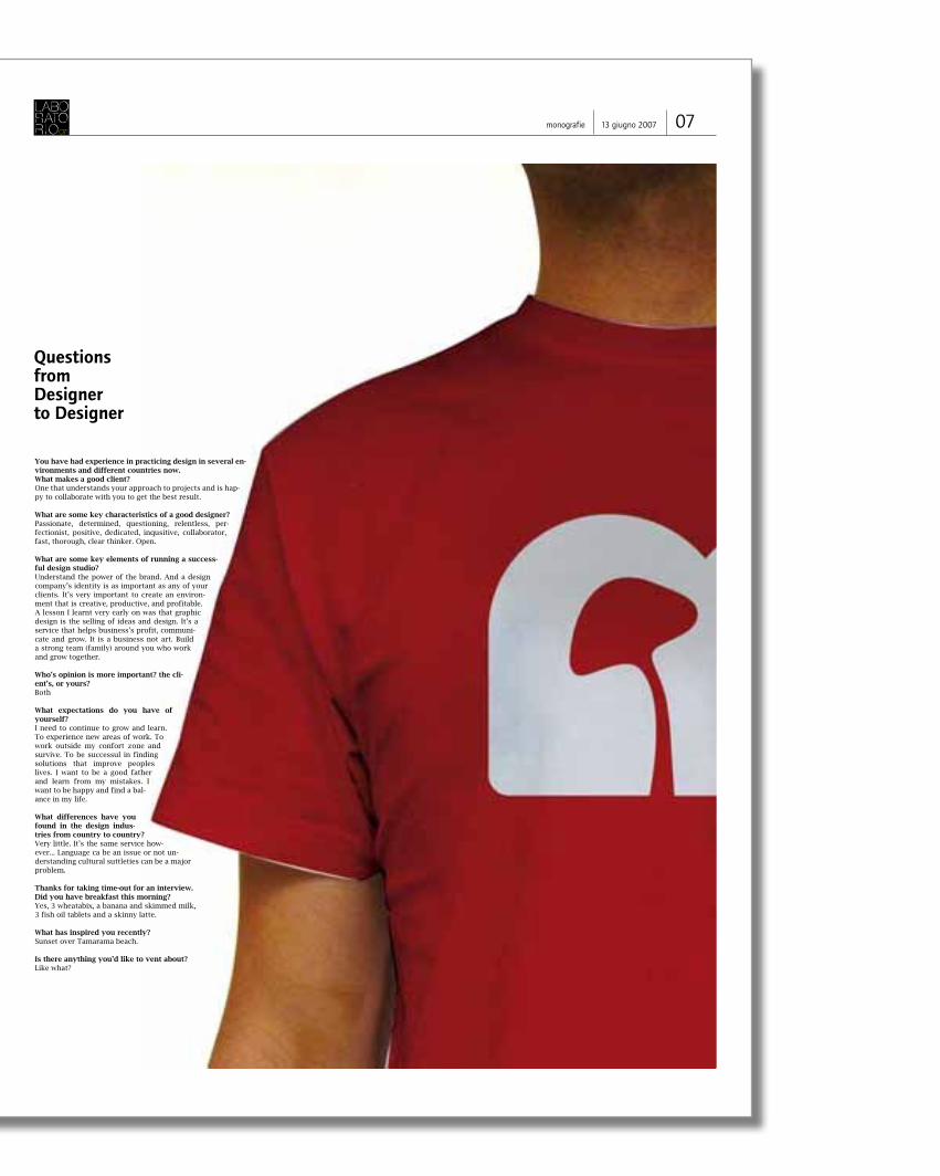
You have had experience in practicing design in several en-vironments and different countries now. What makes a good client?One that understands your approach to projects and is hap-py to collaborate with you to get the best result.
What are some key characteristics of a good designer?Passionate, determined, questioning, relentless, per-fectionist, positive, dedicated, inqusitive, collaborator, fast, thorough, clear thinker. Open.
What are some key elements of running a success-ful design studio?Understand the power of the brand. And a design company’s identity is as important as any of your clients. It’s very important to create an environ-ment that is creative, productive, and profitable. A lesson I learnt very early on was that graphic design is the selling of ideas and design. It’s a service that helps business’s profit, communi-cate and grow. It is a business not art. Build a strong team (family) around you who work and grow together.
Who’s opinion is more important? the cli-ent’s, or yours?Both
What expectations do you have of yourself?I need to continue to grow and learn. To experience new areas of work. To work outside my confort zone and survive. To be successul in finding solutions that improve peoples lives. I want to be a good father and learn from my mistakes. I want to be happy and find a bal-ance in my life.
What differences have you found in the design indus-tries from country to country?Very little. It’s the same service how-ever... Language ca be an issue or not un-derstanding cultural suttleties can be a major problem.
Thanks for taking time-out for an interview. Did you have breakfast this morning?Yes, 3 wheatabix, a banana and skimmed milk, 3 fish oil tablets and a skinny latte.
What has inspired you recently? Sunset over Tamarama beach.
Is there anything you’d like to vent about? Like what?
Questions from Designer to Designer
0713 giugno 2007monografie
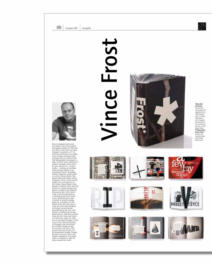
Born in England and raised in Canada, Vince Frost joined Pentagram London in 1989 and just three years later was their youngest Associate at 27. In 1994 he started his own studio, Frost Design, creating award-winning work for clients from The Independent newspaper to Nike. In 2003 Vince relocated to Sydney Australia, from where he now runs his 25+ creative studio – working on anything from postage stamps to in-ternational clients, including D&AD’s magazine Ampersand, as well as Warner Music, Mac-quarie Bank and Sydney Dance Company. Frost’s work was the subject of a retrospective at the Sydney Opera House from January to March 2006, and will feature in a major design exhi-bition at Sydney’s Powerhouse Museum in late 2006. Frost’s work is also documented in a 500-page book Frost*(sorry trees), spanning more than a decade of award-winning projects. A member of CSD, D&AD, ISTD and AGI, Frost’s work has been acknowledged with many awards includ-ing golds from the New York Society of Publication Design, D&AD silvers, and other awards from the New York and Tokyo Art Directors’ Clubs. In 1996, he was awarded Designer of the Year at the Chartered Society of Designers and shortlisted for the BBC design awards. He recently won three 2006 awards from the Society for Environmental Graphic Design. He plays an active role in the design community with many talks at conferences and col-leges around the world.
Vinc
e Fr
ost
◄New Mini Frost Book: This book has been printed with vegetable inks on 100% recycled stock. It includes 400 pages of work in progress documenting our first exciting year businnes as Frost design Sidney.▼Sidney Opera House Poster: Poster for the corporate image of the Sidney Opera House.
06 13 giugno 2007 monografie
You have had experience in practicing design in several en-vironments and different countries now. What makes a good client?One that understands your approach to projects and is hap-py to collaborate with you to get the best result.
What are some key characteristics of a good designer?Passionate, determined, questioning, relentless, per-fectionist, positive, dedicated, inqusitive, collaborator, fast, thorough, clear thinker. Open.
What are some key elements of running a success-ful design studio?Understand the power of the brand. And a design company’s identity is as important as any of your clients. It’s very important to create an environ-ment that is creative, productive, and profitable. A lesson I learnt very early on was that graphic design is the selling of ideas and design. It’s a service that helps business’s profit, communi-cate and grow. It is a business not art. Build a strong team (family) around you who work and grow together.
Who’s opinion is more important? the cli-ent’s, or yours?Both
What expectations do you have of yourself?I need to continue to grow and learn. To experience new areas of work. To work outside my confort zone and survive. To be successul in finding solutions that improve peoples lives. I want to be a good father and learn from my mistakes. I want to be happy and find a bal-ance in my life.
What differences have you found in the design indus-tries from country to country?Very little. It’s the same service how-ever... Language ca be an issue or not un-derstanding cultural suttleties can be a major problem.
Thanks for taking time-out for an interview. Did you have breakfast this morning?Yes, 3 wheatabix, a banana and skimmed milk, 3 fish oil tablets and a skinny latte.
What has inspired you recently? Sunset over Tamarama beach.
Is there anything you’d like to vent about? Like what?
Questions from Designer to Designer
0713 giugno 2007monografie
Born in England and raised in Canada, Vince Frost joined Pentagram London in 1989 and just three years later was their youngest Associate at 27. In 1994 he started his own studio, Frost Design, creating award-winning work for clients from The Independent newspaper to Nike. In 2003 Vince relocated to Sydney Australia, from where he now runs his 25+ creative studio – working on anything from postage stamps to in-ternational clients, including D&AD’s magazine Ampersand, as well as Warner Music, Mac-quarie Bank and Sydney Dance Company. Frost’s work was the subject of a retrospective at the Sydney Opera House from January to March 2006, and will feature in a major design exhi-bition at Sydney’s Powerhouse Museum in late 2006. Frost’s work is also documented in a 500-page book Frost*(sorry trees), spanning more than a decade of award-winning projects. A member of CSD, D&AD, ISTD and AGI, Frost’s work has been acknowledged with many awards includ-ing golds from the New York Society of Publication Design, D&AD silvers, and other awards from the New York and Tokyo Art Directors’ Clubs. In 1996, he was awarded Designer of the Year at the Chartered Society of Designers and shortlisted for the BBC design awards. He recently won three 2006 awards from the Society for Environmental Graphic Design. He plays an active role in the design community with many talks at conferences and col-leges around the world.
Vinc
e Fr
ost
◄New Mini Frost Book: This book has been printed with vegetable inks on 100% recycled stock. It includes 400 pages of work in progress documenting our first exciting year businnes as Frost design Sidney.▼Sidney Opera House Poster: Poster for the corporate image of the Sidney Opera House.
06 13 giugno 2007 monografie
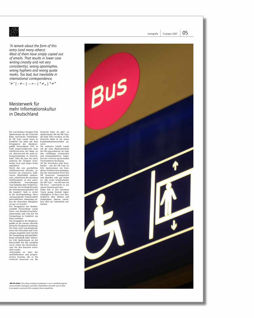
Meisterwerk für mehr Informationskultur in Deutschland
Die vom Berliner Designer Erik Spiekermann für die Deutsche Bahn entwickelte Schriftfami-lie DB Type wurde heute in Frankfurt am Main mit dem Designpreis der Bundesre-publik Deutschland 2007 in Gold ausgezeichnet.Das neue Schriftensystem der Bahn sei ein „Meisterwerk für mehr In-formationskultur in Deutsch-land“, lobte die Jury, der unter anderem die Designer Kons-tantin Grcic und James Irvine angehören. Durch das neu geschaffene Schriftensystem entstehe „ei-nerseits ein erneuertes, kulti-viertes Markenbild, anderer-seits „erleichtern die einzelnen Schriftschnitte in den unter-schiedlichen Anwendungen vom Fahrplan über Wegleitsys-teme bis zur Werbedrucksache die Informationsaufnahme für die Kunden“, hieß es weiter in der Jurybegründung. Diese „herausragende Funktionalität und kultivierte Anmutung ste-hen der deutschen Alltagskul-tur gut zu Gesicht“.Der Designpreis der Bundes-republik Deutschland wurde heute vom Bundeswirtschafts-ministerium und vom Rat für Formgebung in Frankfurt am Main verliehen. Der Designpreis der Bundesre-publik ist die einzige offizielle deutsche Designauszeichnung. Der Preis wird vom Bundesmi-nister für Wirtschaft und Tech-nologie ausgelobt und vom Rat für Formgebung durchgeführt. Rund eineinhalb Jahre arbeite-ten Erik Spiekermann an der Hausschrift der DB, nachdem zuvor schon ein Literaturkon-zept für den Konzern entwi-ckelt wurde. „Entstanden ist eines der ausführlichsten und progres-sivsten Systeme, die es für weltweite Konzerne wie die
Deutsche Bahn AG gibt“, so Spiekermann. Mit der DB Type, die Ende 2005 erschien, sei die Deutsche Bahn in ein neues Kommunikationszeitalter ge-tartet. Die exklusive Schrift wurde auf die neue Markenstruktur der DB zugeschnitten: Sie trägt den vielfältigen technischen und kommunikativen Aufga-ben des weltweit operierenden Unternehmens Rechnung. Ob für Newsticker oder Kurs-bücher – mit der DB Type ist Erik Spiekermann ein kom-plexes Schriftsystem gelungen, das die emotionalen Werte des DB Konzerns transportiert und überdies sehr gut lesbar ist. Alle sechs Schriftschnitte der DB Type – von DB Sans bis DB News – entwickelte er aus einem Formenrepertoire. Dabei ließ er den einzelnen Typen genug formale Eigen-ständigkeit, so dass zwar Ähn-lichkeiten über Medien und Zielgruppen hinweg entste-hen, aber nie Uniformität auf-kommt.
“A remark about the form of this entry (and many others):Most of them have simply copied out of emails. That results in lower case writing (mostly and not very consistently), wrong apostrophes, wrong hyphens and wrong quote marks. Too bad, but inevitable in international correspondence. ‘ ≠ ’ | - ≠ – | -- ≈ – | “ ≠ „ | “ ≠ ”
◄►Die Bahn: The railway company of yesteryear is now a worldwide logistics service provider. Passengers, journalists, shareholders, the public eye: all have to be equally convinced of the company’s future capabilities.
Prof. Dr. h.c. Erik Spiekermann (1947) studied History of Art and English in Berlin. He is information achitect, type de-signer (ff Meta, itc Officina, ff Info, ff Unit, LoType, Berliner Grotesk et al) and
Questions from Designer to Designer
Erik Spiekermann
04 13 giugno 2007 monografie 0513 giugno 2007monografie
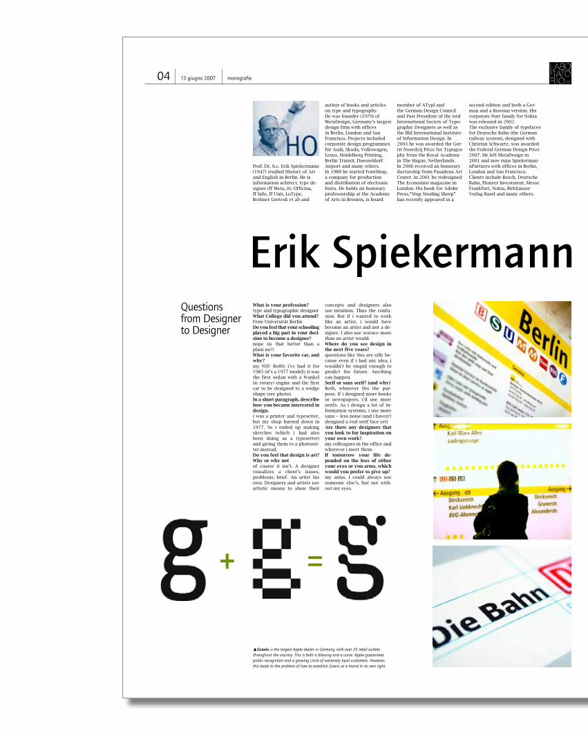
What is your profession?type and typographic designerWhat College did you attend?Freie Universität BerlinDo you feel that your schooling played a big part in your deci-sion to become a designer?nope (is that better than a plain no?)What is your favorite car, and why?my NSU Ro80; i’ve had it for 1985 (it’s a 1977 model); it was the first sedan with a Wankel (ie rotary) engine and the first car to be designed to a wedge shape (see photo). In a short paragraph, describe how you became interested in design.i was a printer and typesetter, but my shop burned down in 1977. So i ended up making sketches (which i had also been doing as a typesetter) and giving them to a photoset-ter instead.Do you feel that design is art? Why or why notof course it isn’t. A designer visualizes a client’s issues, problems, brief. An artist his own. Designers and artists use artistic means to show their
concepts and designers also use intuition. Thus the confu-sion. But if i wanted to work like an artist, i would have become an artist and not a de-signer. I also use science more than an artist would.Where do you see design in the next five years?questions like this are silly be-cause even if i had any idea, i wouldn’t be stupid enough to predict the future. Anything can happen.Serif or sans serif? (and why)Both, whatever fits the pur-pose. If i designed more books or newspapers, i’d use more serifs. As i design a lot of in-formation systems, i use more sans -- less noise (and i haven’t designed a real serif face yet)Are there any designers that you look to for inspiration on your own work?my colleagues in the office and wherever i meet themIf tomorrow your life de-pended on the loss of either your eyes or you arms, which would you prefer to give up?my arms. I could always use someone else’s, but not with-out my eyes.
author of books and articles on type and typography. He was founder (1979) of MetaDesign, Germany’s largest design firm with offices in Berlin, London and San Francisco. Projects included corporate design programmes for Audi, Skoda, Volkswagen, Lexus, Heidelberg Printing, Berlin Transit, Duesseldorf Airport and many others. In 1988 he started FontShop, a company for production and distribution of electronic fonts. He holds an honorary professorship at the Academy of Arts in Bremen, is board
member of ATypI and the German Design Council and Past President of the istd International Society of Typo-graphic Designers as well as the IIId International Institute of Information Design. In 2003 he was awarded the Ger-rit Noordzij Prize for Typogra-phy from the Royal Academy in The Hague, Netherlands. In 2006 received an honorary doctorship from Pasadena Art Center. In 2001 he redesigned The Economist magazine in London. His book for Adobe Press,“Stop Stealing Sheep” has recently appeared in a
second edition and both a Ger-man and a Russian version. His corporate font family for Nokia was released in 2002. The exclusive family of typefaces for Deutsche Bahn (the German railway system), designed with Christan Schwartz, was awarded the Federal German Design Prize 2007. He left MetaDesign in 2001 and now runs Spiekerman-nPartners with offices in Berlin, London and San Francisco. Clients include Bosch, Deutsche Bahn, Pioneer Investment, Messe Frankfurt, Nokia, Birkhäuser Verlag Basel and many others.
▲Gravis is the largest Apple dealer in Germany, with over 25 retail outlets throughout the country. This is both a blessing and a curse. Apple guarantees public recognition and a growing circle of extremely loyal customers. However, this leads to the problem of how to establish Gravis as a brand in its own right.
Meisterwerk für mehr Informationskultur in Deutschland
Die vom Berliner Designer Erik Spiekermann für die Deutsche Bahn entwickelte Schriftfami-lie DB Type wurde heute in Frankfurt am Main mit dem Designpreis der Bundesre-publik Deutschland 2007 in Gold ausgezeichnet.Das neue Schriftensystem der Bahn sei ein „Meisterwerk für mehr In-formationskultur in Deutsch-land“, lobte die Jury, der unter anderem die Designer Kons-tantin Grcic und James Irvine angehören. Durch das neu geschaffene Schriftensystem entstehe „ei-nerseits ein erneuertes, kulti-viertes Markenbild, anderer-seits „erleichtern die einzelnen Schriftschnitte in den unter-schiedlichen Anwendungen vom Fahrplan über Wegleitsys-teme bis zur Werbedrucksache die Informationsaufnahme für die Kunden“, hieß es weiter in der Jurybegründung. Diese „herausragende Funktionalität und kultivierte Anmutung ste-hen der deutschen Alltagskul-tur gut zu Gesicht“.Der Designpreis der Bundes-republik Deutschland wurde heute vom Bundeswirtschafts-ministerium und vom Rat für Formgebung in Frankfurt am Main verliehen. Der Designpreis der Bundesre-publik ist die einzige offizielle deutsche Designauszeichnung. Der Preis wird vom Bundesmi-nister für Wirtschaft und Tech-nologie ausgelobt und vom Rat für Formgebung durchgeführt. Rund eineinhalb Jahre arbeite-ten Erik Spiekermann an der Hausschrift der DB, nachdem zuvor schon ein Literaturkon-zept für den Konzern entwi-ckelt wurde. „Entstanden ist eines der ausführlichsten und progres-sivsten Systeme, die es für weltweite Konzerne wie die
Deutsche Bahn AG gibt“, so Spiekermann. Mit der DB Type, die Ende 2005 erschien, sei die Deutsche Bahn in ein neues Kommunikationszeitalter ge-tartet. Die exklusive Schrift wurde auf die neue Markenstruktur der DB zugeschnitten: Sie trägt den vielfältigen technischen und kommunikativen Aufga-ben des weltweit operierenden Unternehmens Rechnung. Ob für Newsticker oder Kurs-bücher – mit der DB Type ist Erik Spiekermann ein kom-plexes Schriftsystem gelungen, das die emotionalen Werte des DB Konzerns transportiert und überdies sehr gut lesbar ist. Alle sechs Schriftschnitte der DB Type – von DB Sans bis DB News – entwickelte er aus einem Formenrepertoire. Dabei ließ er den einzelnen Typen genug formale Eigen-ständigkeit, so dass zwar Ähn-lichkeiten über Medien und Zielgruppen hinweg entste-hen, aber nie Uniformität auf-kommt.
“A remark about the form of this entry (and many others):Most of them have simply copied out of emails. That results in lower case writing (mostly and not very consistently), wrong apostrophes, wrong hyphens and wrong quote marks. Too bad, but inevitable in international correspondence. ‘ ≠ ’ | - ≠ – | -- ≈ – | “ ≠ „ | “ ≠ ”
◄►Die Bahn: The railway company of yesteryear is now a worldwide logistics service provider. Passengers, journalists, shareholders, the public eye: all have to be equally convinced of the company’s future capabilities.
Prof. Dr. h.c. Erik Spiekermann (1947) studied History of Art and English in Berlin. He is information achitect, type de-signer (ff Meta, itc Officina, ff Info, ff Unit, LoType, Berliner Grotesk et al) and
Questions from Designer to Designer
Erik Spiekermann
04 13 giugno 2007 monografie 0513 giugno 2007monografie
What is your profession?type and typographic designerWhat College did you attend?Freie Universität BerlinDo you feel that your schooling played a big part in your deci-sion to become a designer?nope (is that better than a plain no?)What is your favorite car, and why?my NSU Ro80; i’ve had it for 1985 (it’s a 1977 model); it was the first sedan with a Wankel (ie rotary) engine and the first car to be designed to a wedge shape (see photo). In a short paragraph, describe how you became interested in design.i was a printer and typesetter, but my shop burned down in 1977. So i ended up making sketches (which i had also been doing as a typesetter) and giving them to a photoset-ter instead.Do you feel that design is art? Why or why notof course it isn’t. A designer visualizes a client’s issues, problems, brief. An artist his own. Designers and artists use artistic means to show their
concepts and designers also use intuition. Thus the confu-sion. But if i wanted to work like an artist, i would have become an artist and not a de-signer. I also use science more than an artist would.Where do you see design in the next five years?questions like this are silly be-cause even if i had any idea, i wouldn’t be stupid enough to predict the future. Anything can happen.Serif or sans serif? (and why)Both, whatever fits the pur-pose. If i designed more books or newspapers, i’d use more serifs. As i design a lot of in-formation systems, i use more sans -- less noise (and i haven’t designed a real serif face yet)Are there any designers that you look to for inspiration on your own work?my colleagues in the office and wherever i meet themIf tomorrow your life de-pended on the loss of either your eyes or you arms, which would you prefer to give up?my arms. I could always use someone else’s, but not with-out my eyes.
author of books and articles on type and typography. He was founder (1979) of MetaDesign, Germany’s largest design firm with offices in Berlin, London and San Francisco. Projects included corporate design programmes for Audi, Skoda, Volkswagen, Lexus, Heidelberg Printing, Berlin Transit, Duesseldorf Airport and many others. In 1988 he started FontShop, a company for production and distribution of electronic fonts. He holds an honorary professorship at the Academy of Arts in Bremen, is board
member of ATypI and the German Design Council and Past President of the istd International Society of Typo-graphic Designers as well as the IIId International Institute of Information Design. In 2003 he was awarded the Ger-rit Noordzij Prize for Typogra-phy from the Royal Academy in The Hague, Netherlands. In 2006 received an honorary doctorship from Pasadena Art Center. In 2001 he redesigned The Economist magazine in London. His book for Adobe Press,“Stop Stealing Sheep” has recently appeared in a
second edition and both a Ger-man and a Russian version. His corporate font family for Nokia was released in 2002. The exclusive family of typefaces for Deutsche Bahn (the German railway system), designed with Christan Schwartz, was awarded the Federal German Design Prize 2007. He left MetaDesign in 2001 and now runs Spiekerman-nPartners with offices in Berlin, London and San Francisco. Clients include Bosch, Deutsche Bahn, Pioneer Investment, Messe Frankfurt, Nokia, Birkhäuser Verlag Basel and many others.
▲Gravis is the largest Apple dealer in Germany, with over 25 retail outlets throughout the country. This is both a blessing and a curse. Apple guarantees public recognition and a growing circle of extremely loyal customers. However, this leads to the problem of how to establish Gravis as a brand in its own right.
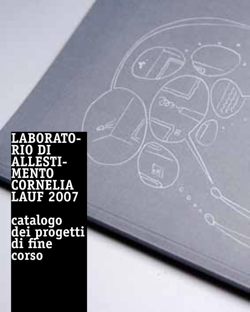
laBoRato-Rio diallesti-mentoCoRnelialauf 2007
catalogodei progettidi finecorso
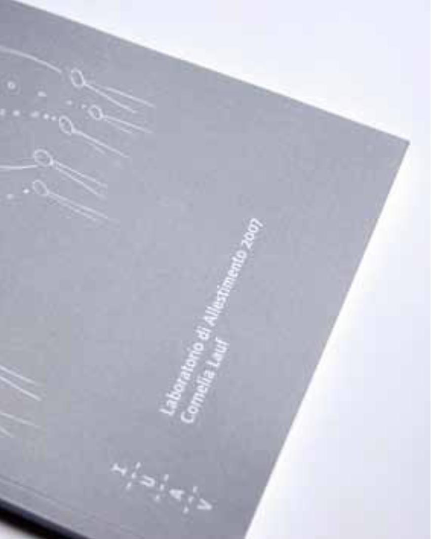
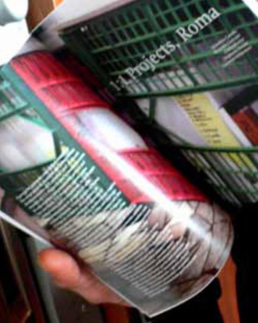
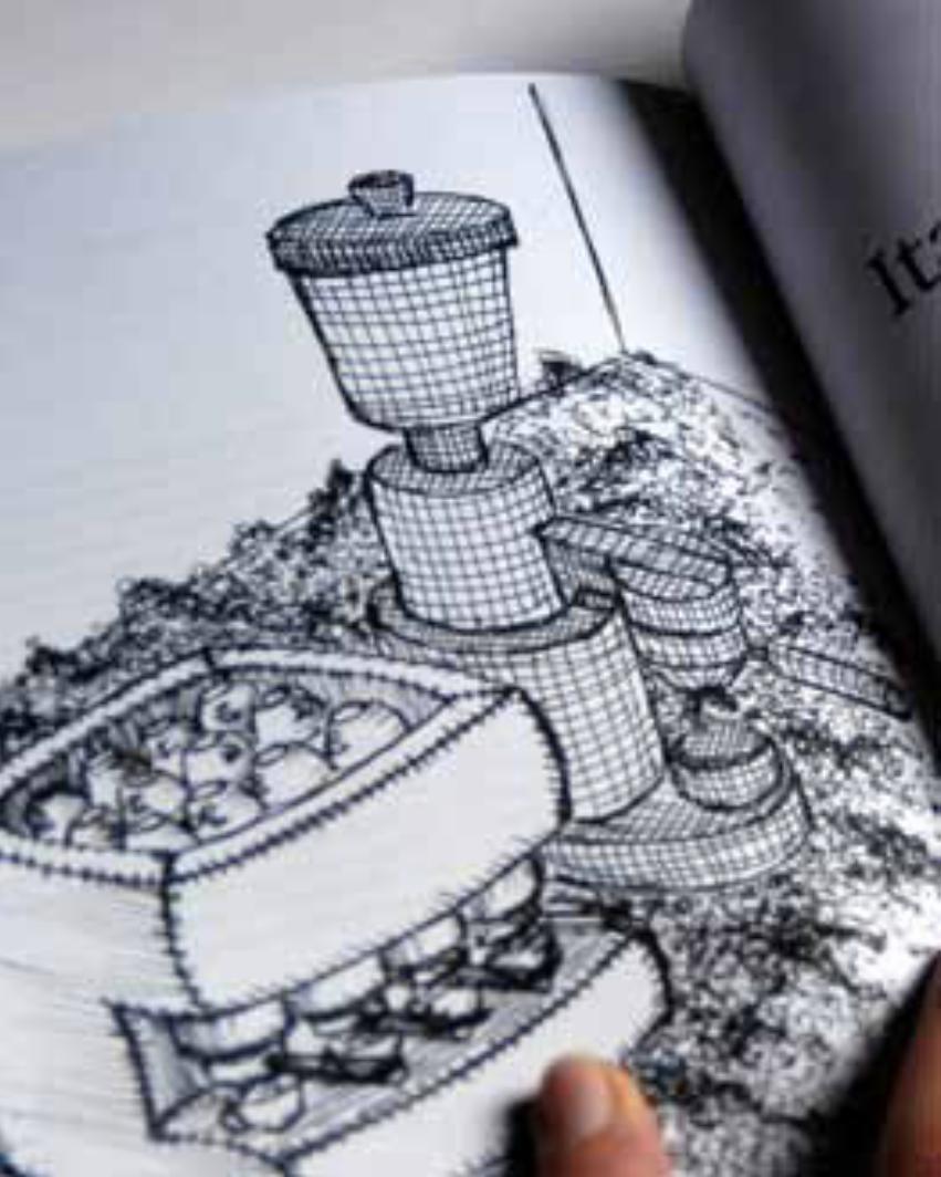
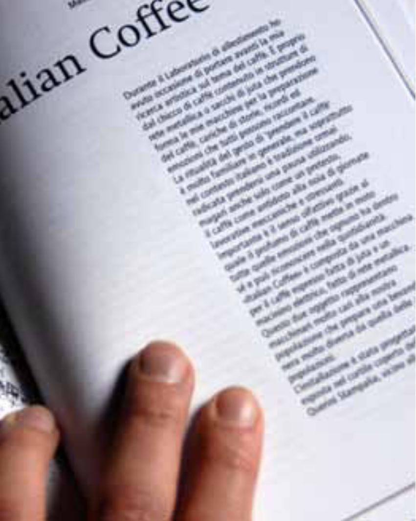
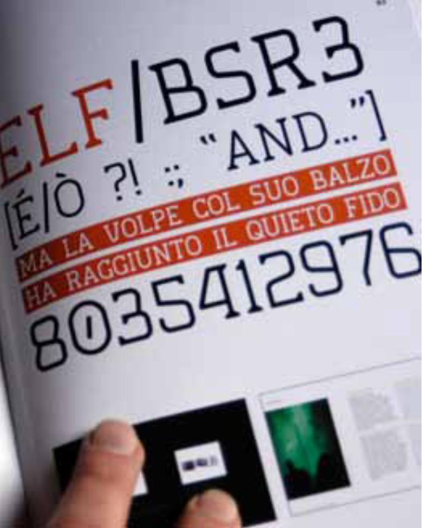
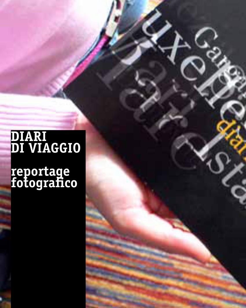
diaRidi viaggio
reportagefotografico
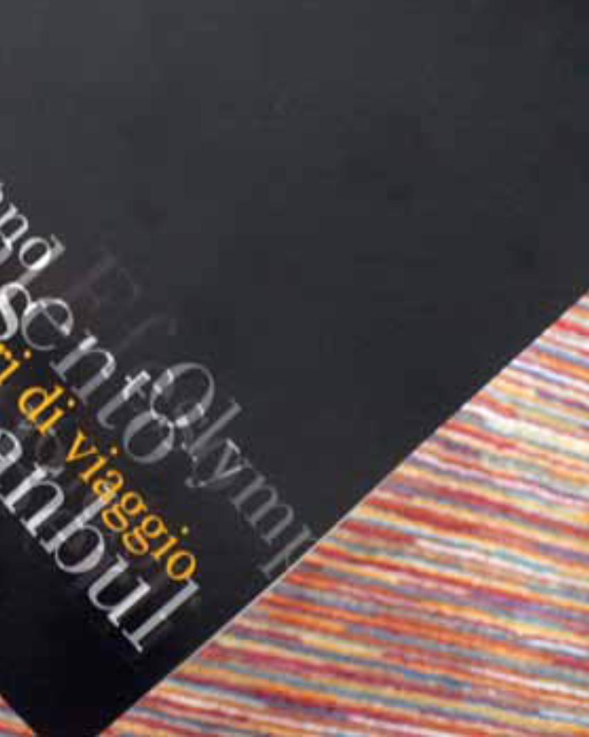
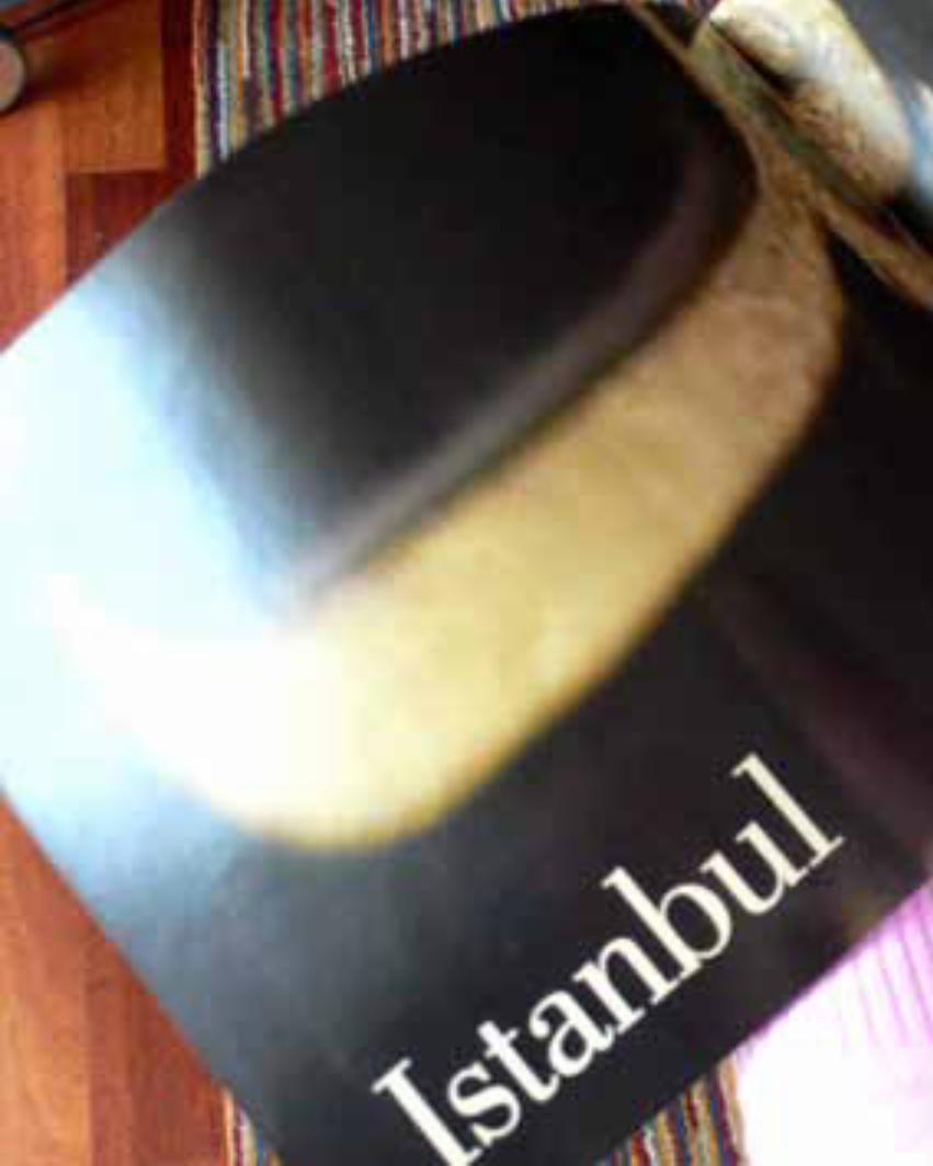
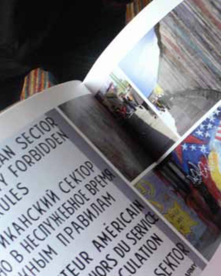

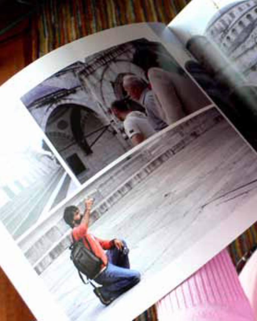

__exhibitions
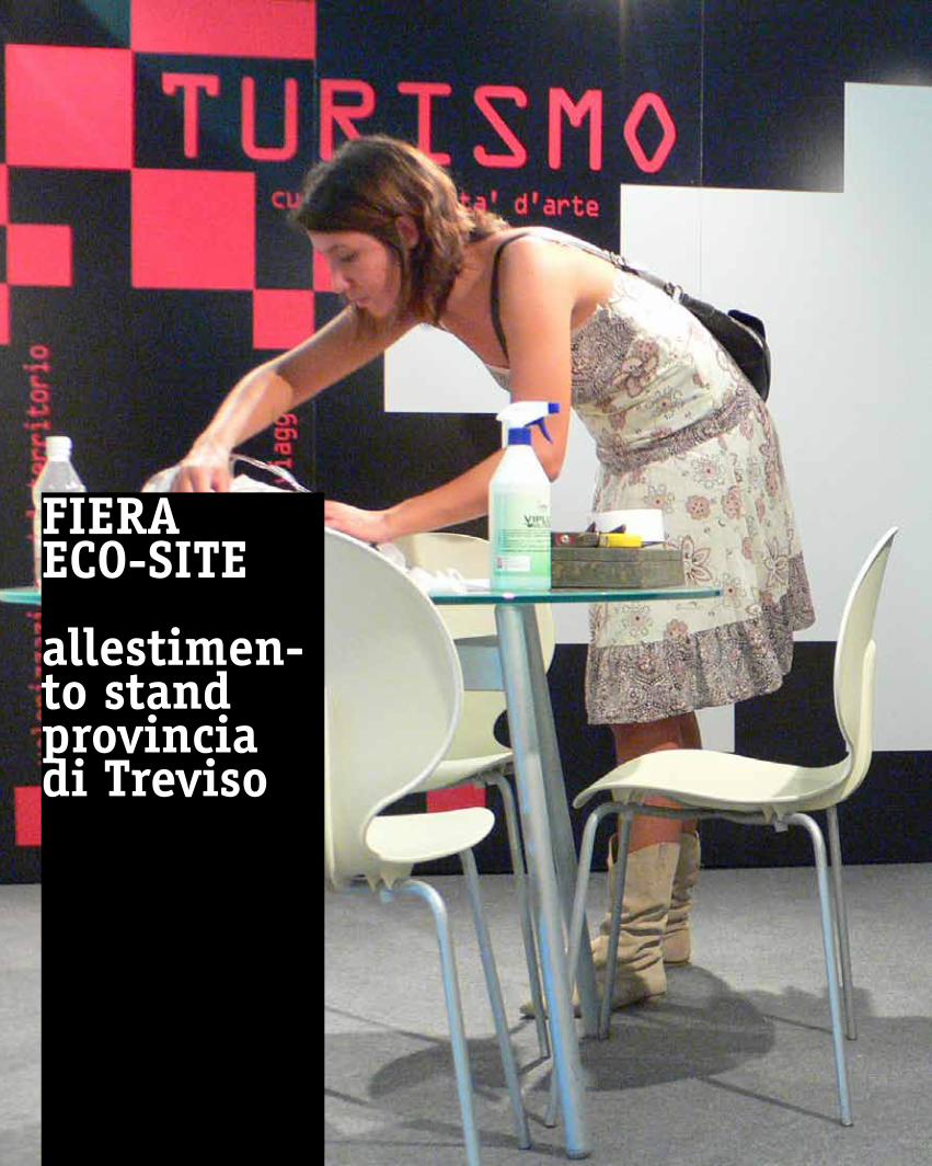
fieRaeCo-site
allestimen-to standprovincia di treviso