Download - Review Of A Kerrang Cover
Review Of A Kerrang Magazine
Cover By Charlotte Walsh
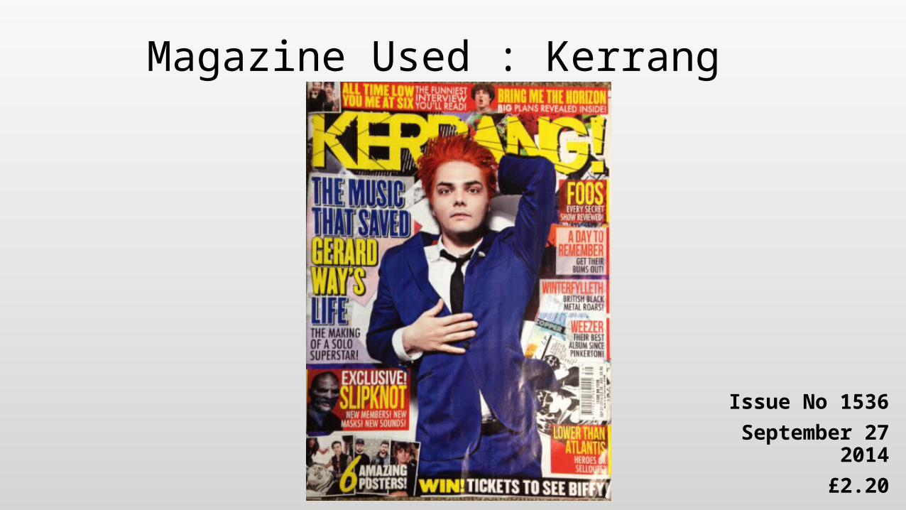
Magazine Used : Kerrang
Issue No 1536
September 27 2014
£2.20
Image Photos and their connotations
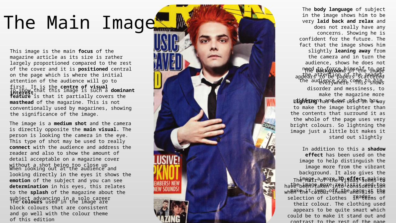
The Main Image This image is the main focus of the magazine article as its size is rather largely proportioned compared to the rest of the cover and it is positioned central on the page which is where the initial attention of the audience will go to first. It is the centre of visual interest.
To show that this image is such a dominant feature is that it partially covers the masthead of the magazine. This is not conventionally used by magazines, showing the significance of the image.
The image is a medium shot and the camera is directly opposite the main visual. The person is looking the camera in the eye. This type of shot may be used to really connect with the audience and address the reader and also to show the amount of detail acceptable on a magazine cover without a shot being too close up
When looking out at the audience and looking directly in the eyes it shows the emotion of the subject and you can see determination in his eyes, this relates to the splash of the magazine about the subject advancing in a solo career
The body language of subject in the image shows him to be very laid back and relax
and does not really have any concerns. Showing he is confident for the future. The
fact that the image shows him slightly leaning away from the camera and in turn the audience, shows he does not need to
force himself to get the attention of the reader, the audience can come to him.
The background of the image appears to be papers scattered everywhere. This shows
disorder and messiness, to make the magazine more different and out of the box.
Lighting has been used in a way to make the image brighter than the contents that surround
it as the whole of the page uses very bright colours. So lightning the image just a little bit
makes it stand out slightly
In addition to this a shadow effect has been used on the image to help distinguish the
image more from the vibrant background. It also gives the image a more 3D effect making
the image more realistic and too make it jump off the page at the reader.
The colours used in the image are block colours that are consistent and go well with the colour theme of this edition
The hair of the visual seems to have been taken into consideration when the colour theme and
also the selection of clothes in terms of their colour. The clothing used appears to be quite
smart which could be to make it stand out and contrast to the rest of the page which is very
disorganised. Finally, make up is used to emphasis facial detail.
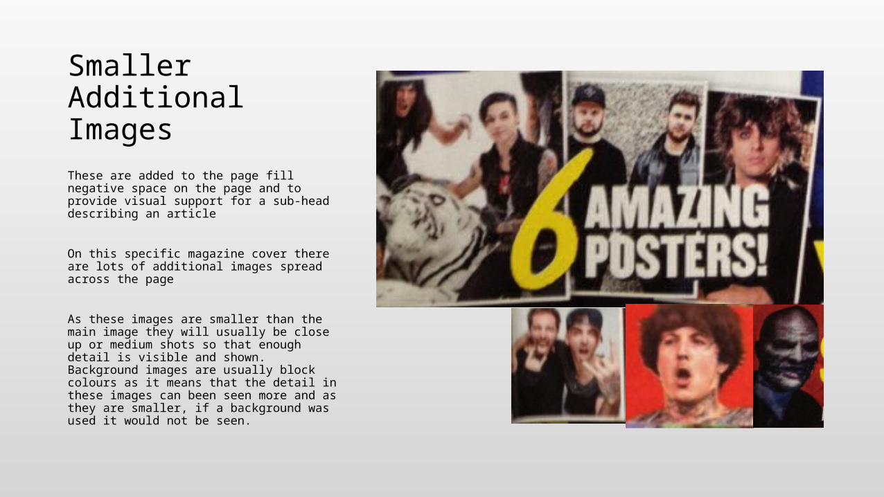
Smaller Additional Images These are added to the page fill negative space on the page and to provide visual support for a sub-head describing an article
On this specific magazine cover there are lots of additional images spread across the page
As these images are smaller than the main image they will usually be close up or medium shots so that enough detail is visible and shown. Background images are usually block colours as it means that the detail in these images can been seen more and as they are smaller, if a background was used it would not be seen.
Text Title, sub heading etc. and their connotations
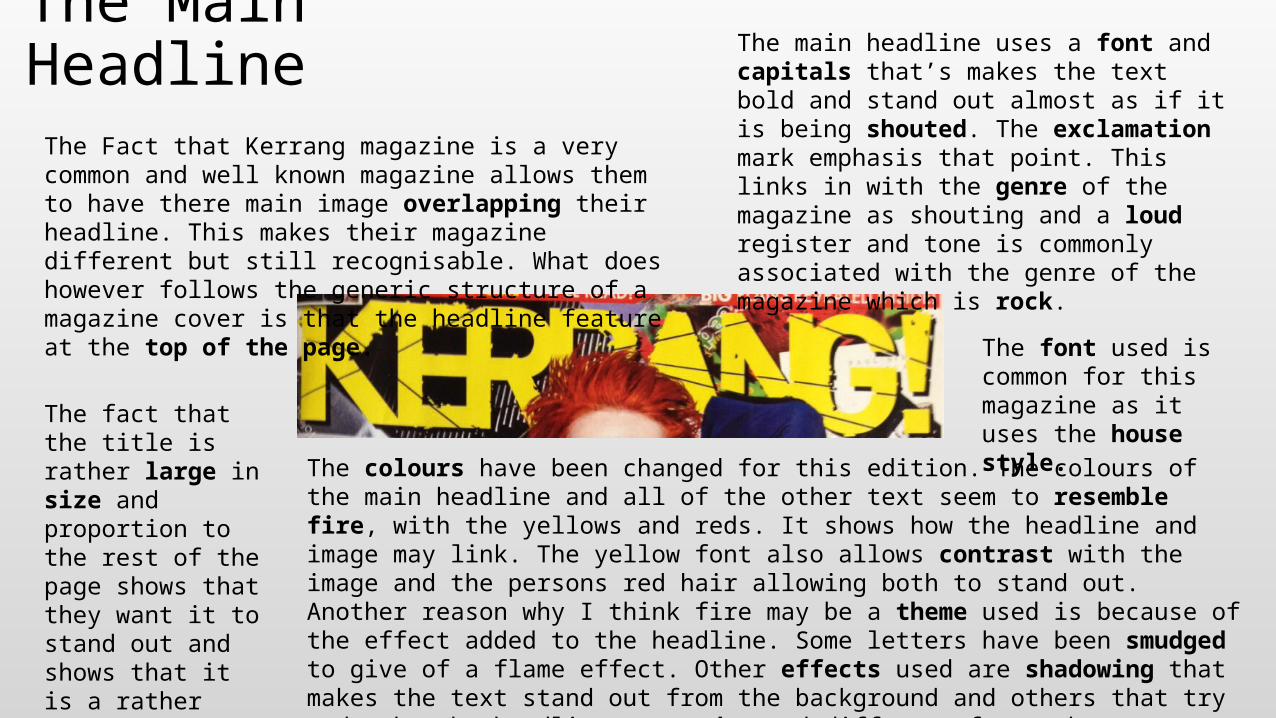
The Main Headline The main headline uses a font and capitals that’s makes the text bold and stand out almost as if it is being shouted. The exclamation mark emphasis that point. This links in with the genre of the magazine as shouting and a loud register and tone is commonly associated with the genre of the magazine which is rock.
The Fact that Kerrang magazine is a very common and well known magazine allows them to have there main image overlapping their headline. This makes their magazine different but still recognisable. What does however follows the generic structure of a magazine cover is that the headline feature at the top of the page.
The font used is common for this magazine as it uses the house style. The fact that the title
is rather large in size and proportion to the rest of the page shows that they want it to stand out and shows that it is a rather important feature on the page.
The colours have been changed for this edition. The colours of the main headline and all of the other text seem to resemble fire, with the yellows and reds. It shows how the headline and image may link. The yellow font also allows contrast with the image and the persons red hair allowing both to stand out. Another reason why I think fire may be a theme used is because of the effect added to the headline. Some letters have been smudged to give of a flame effect. Other effects used are shadowing that makes the text stand out from the background and others that try and make the headline more edgy and different from other magazines and to make it stand out like its genre rock. Block colours have been used for the text as the background is busy and it enables the reader to read the text more easily.
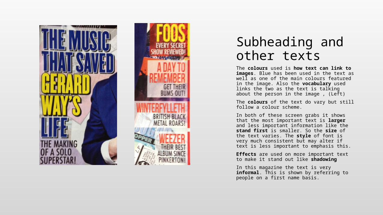
Subheading and other texts The colours used is how text can link to images. Blue has been used in the text as well as one of the main colours featured in the image. Also the vocabulary used links the two as the text is talking about the person in the image , (Left)
The colours of the text do vary but still follow a colour scheme.
In both of these screen grabs it shows that the most important text is larger and less important information like the stand first is smaller. So the size of the text varies. The style of font is very much consistent but may alter if text is less important to emphasis this.
Effects are used on more important text to make it stand out like shadowing
In this magazine the text is very informal. This is shown by referring to people on a first name basis.
Page Layout Use of the page etc.
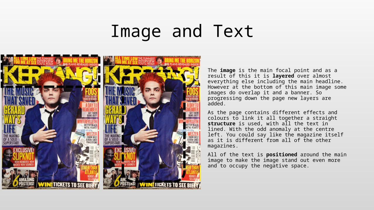
Image and Text
The image is the main focal point and as a result of this it is layered over almost everything else including the main headline. However at the bottom of this main image some images do overlap it and a banner. So progressing down the page new layers are added.
As the page contains different effects and colours to link it all together a straight structure is used, with all the text in lined. With the odd anomaly at the centre left. You could say like the magazine itself as it is different from all of the other magazines.
All of the text is positioned around the main image to make the image stand out even more and to occupy the negative space.
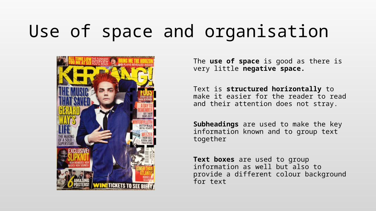
Use of space and organisation
The use of space is good as there is very little negative space.
Text is structured horizontally to make it easier for the reader to read and their attention does not stray.
Subheadings are used to make the key information known and to group text together
Text boxes are used to group information as well but also to provide a different colour background for text


